18th April 2024
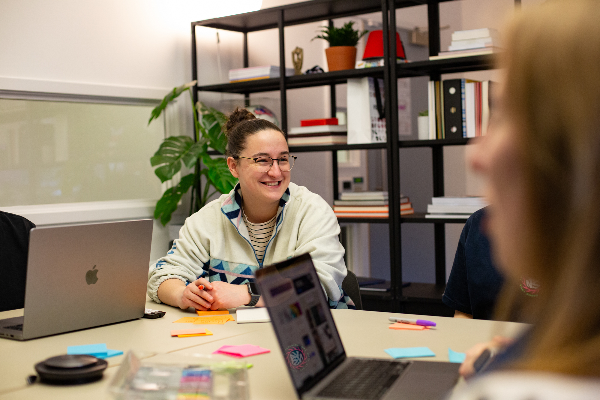
Welcoming Gemma back as Senior Developer
9th September 2023
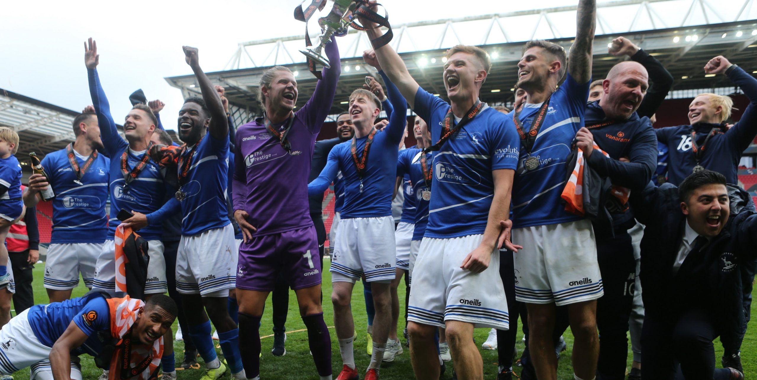
Helping a football club succeed off the pitch
20th June 2023
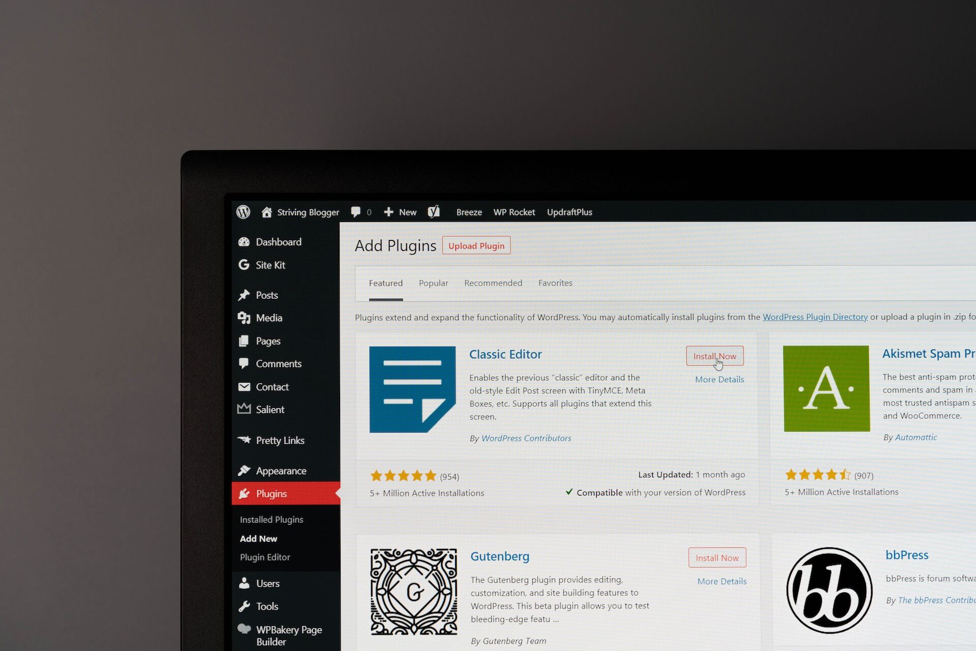
The 8 Must-Have Plugins for Your WordPress Website

30th March 2023
Your New Website is Live… So What?

19th December 2022
5 Brands That Smashed Their Marketing In 2022

23rd November 2022
How to Give Your Brand a Voice that Resonates
21st October 2022
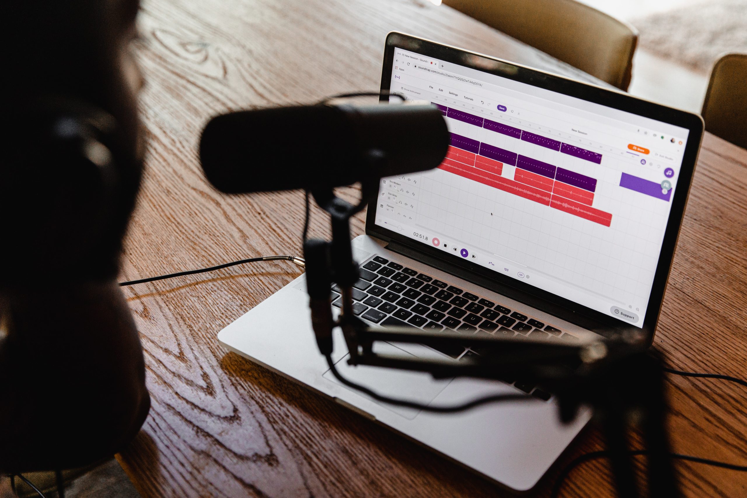
To Cast, or Not to Cast: The Pros and Cons of Company Podcasts
6th October 2022
My Week of Work Experience as a Graphic Designer at Vida

5th October 2022
Marketing and a website launch for Oliver Deacon Coaching

4th October 2022