You’ve been there before, you click a link or type in a URL, hit enter and you’re faced with a big, blank screen with three numbers, 404.
It’s an undesirable, frustrating, and possibly confusing experience, which can often lead to closed pages and high bounce rates.
In this blog, we’ll give you the 101 on 404 pages, what they are, how they affect your SEO, and how to make the most of them. We’ll also be giving a few examples of our favourites from across the web.
What is a 404 page/error?
A 404 page is essentially a destination for all mistyped URLs, expired links and missing pages. The error is displayed when a website visitor has located the server, or site, but not the specific page. This will usually happen when there is an error in the second half of a url, after the main site domain name and a forward slash (/).
For example, if you went to our website, vidacreative.co.uk, and added a destination such as /blog to the end, you would find our blog section. But if you mistyped this, and entered /blgos instead, you’ll be redirected to a 404 page.
Why ‘404’?
In the early days of the internet, there were rumours that the 404 page was named after the CERN server room, or office in which Tim Berners-Lee first conceptualised the World Wide Web.
Sadly, in reality the answer is much less whimsical: the initial 4 denotes a client-side error, meaning that the site is working fine, and the error is the fault of the site visitor. The 04 is simply indicating the error; 400 means “Bad Request”, 401 is “Unauthorised” and so on…
But how does this affect SEO?
Strictly speaking, a 404 page does not negatively, or positively impact your SEO Rankings. However, one of the main causes of 404 errors, broken links, can.
Say you had a blog that you decided was no longer relevant and you delete it from your website. Now wherever that blog is linked to, or wherever that blog link appears (on your site or elsewhere) there will be a broken or ‘dead’ link. When that link is used it will direct you to a 404 error.
Google’s web crawlers hate dead links, and if these are found on your site, it can negatively impact your SEO ranking, as well as your site user experience. On the other hand, if your blog removal breaks links on other sites, you could be missing out on precious, SEO boosting ‘link-juice’.
Making the most out of your 404 page.
Landing on a 404 page can be frustrating for site visitors, however, a well-designed 404 page will turn this negative experience into a positive one. There are a number of ways in which this could be done.
Link to Homepage
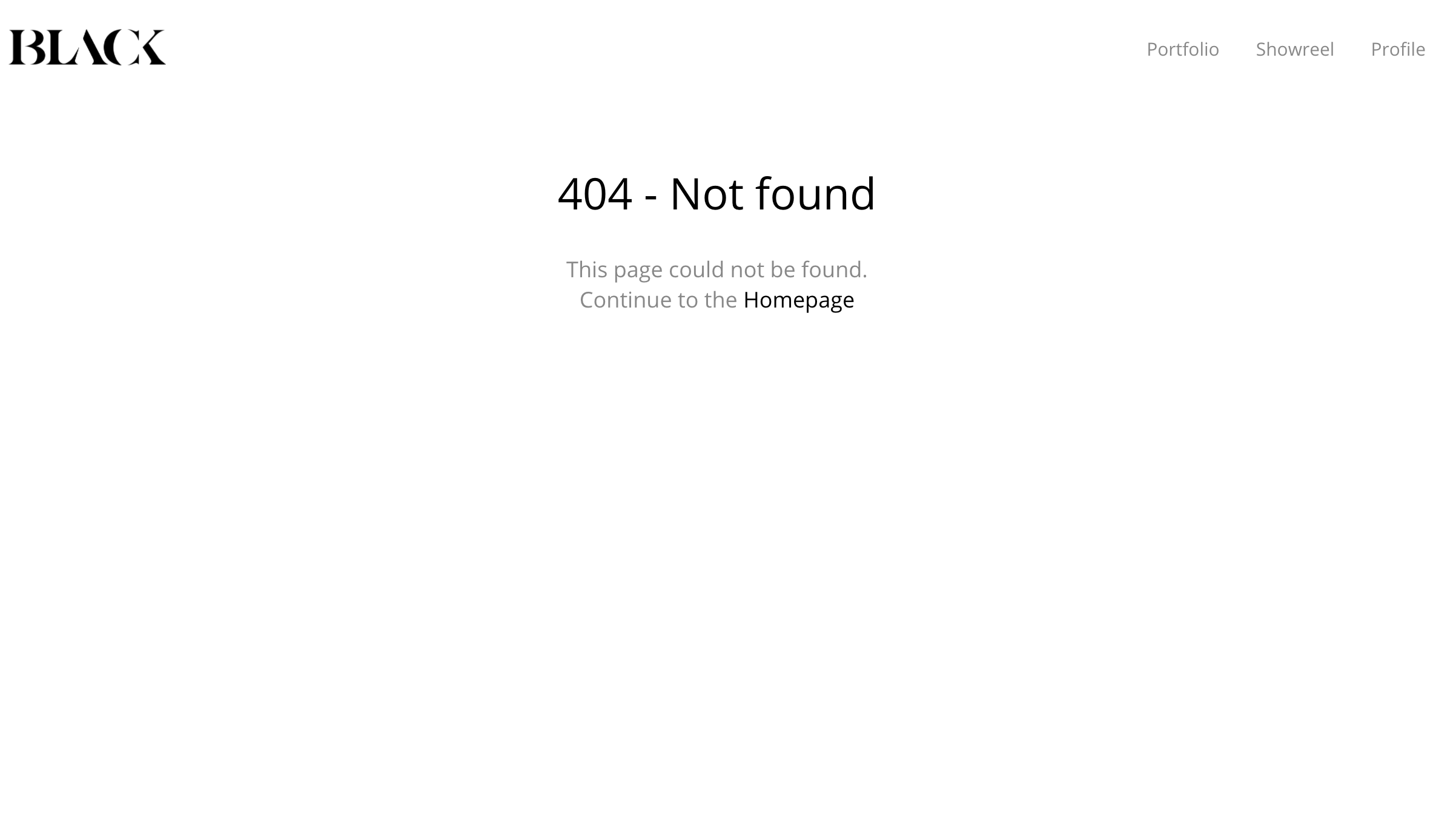
The most common element of any 404 page is a link to the site homepage. This gives users another chance to find the page they are looking for, reducing bounce rates and increasing site session time.
This simple page from designer Craig Black gets the job done, with a simple link to the homepage.
Personalise your page
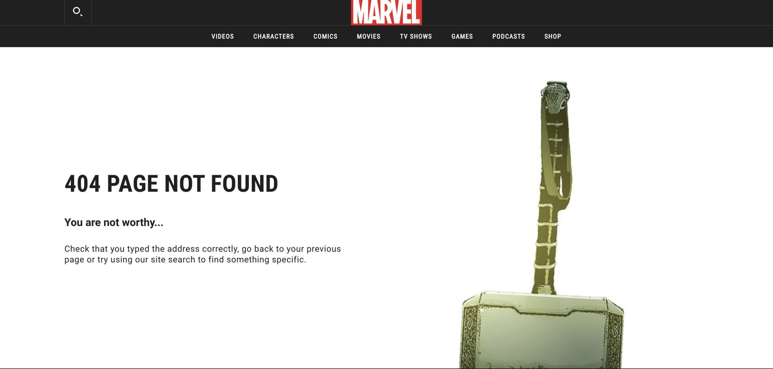
By keeping your 404 page ‘on-brand’, you can reassure visitors that they are in the right place, despite landing on the wrong page.
Marvel’s incredibly on-brand page is unmistakably Marvel, with references to the movies/comics keeping visitors entertained.
Add some humour
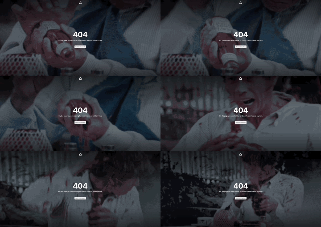
Humour can be a quick way to lessen the frustration of landing on a 404 page. Lighten the mood by making a joke of the situation, or use an image or gif to help your users see the funny side.
This animated 404 screen from Unsplash presents the visitor with a random gif, like this ketchup-calamity.
Make it interactive
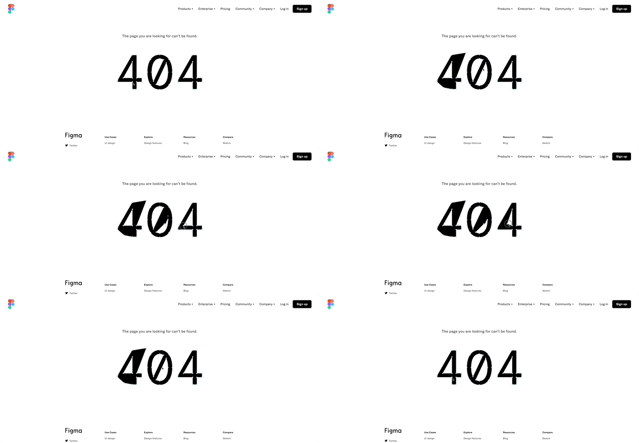
When it comes to 404 pages, the possibilities are endless. If you have the budget (or coding skills) you can even implement an interactive display, which can turn a forgettable mistake into a memorable experience for site users.
This super fun interactive 404 page from figma lets you drag and reshape the 404 text to your heart’s desire.
Need some inspiration?
There are countless 404 pages on the web, some great, some not so great… But if you’re looking to create a memorable, functional page for your site, here are a few more of our favourites:
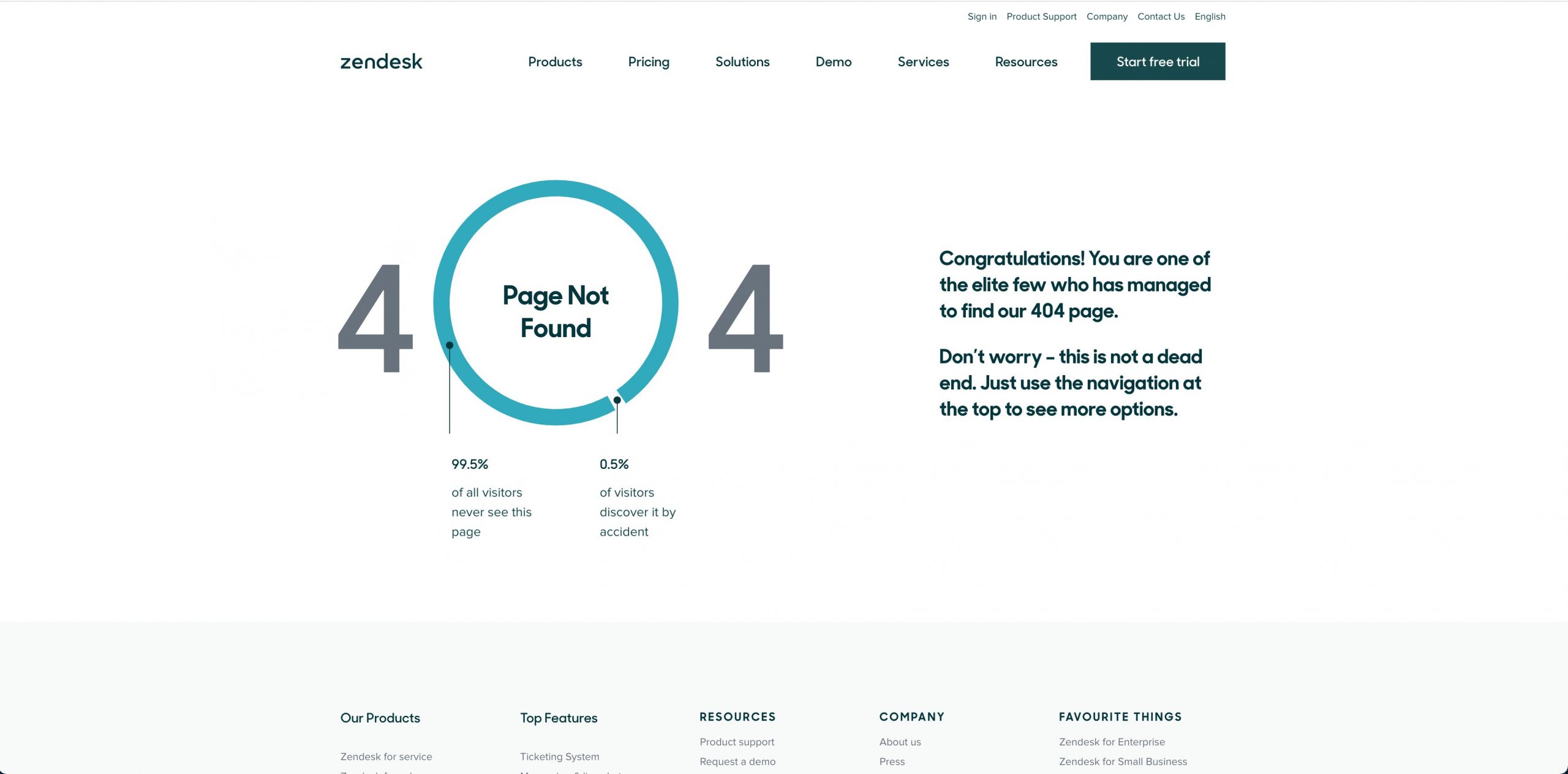
Zendesk’s Informative page enlightens users with some insightful statistics
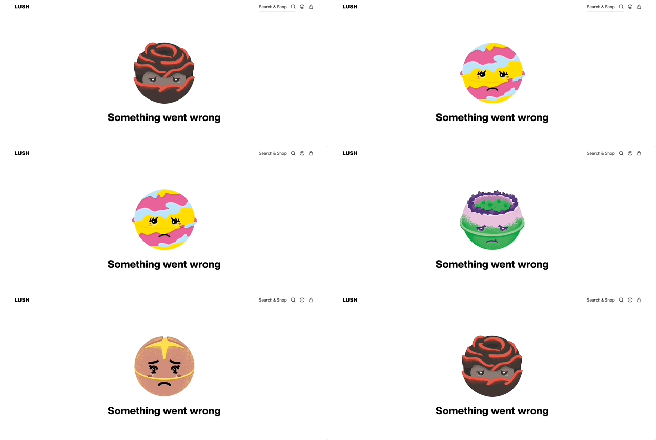
 Lush’s animated 404 page shows a selection of anthropomorphised bath bombs
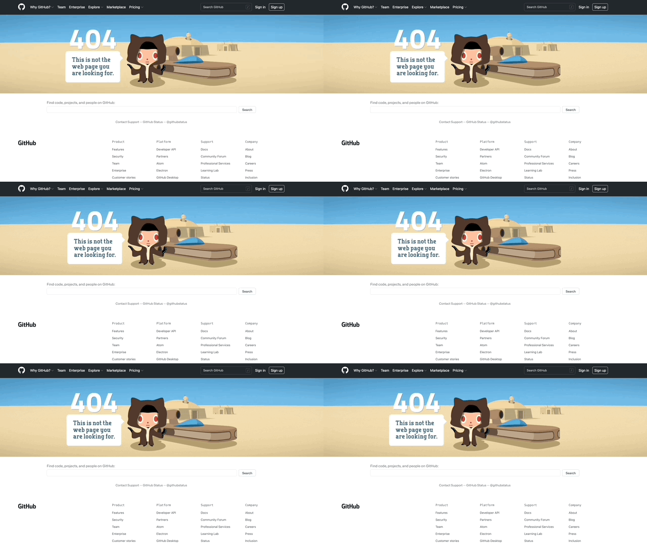
Github’s Star Wars themed 404 page includes a cartoon jedi and movie reference
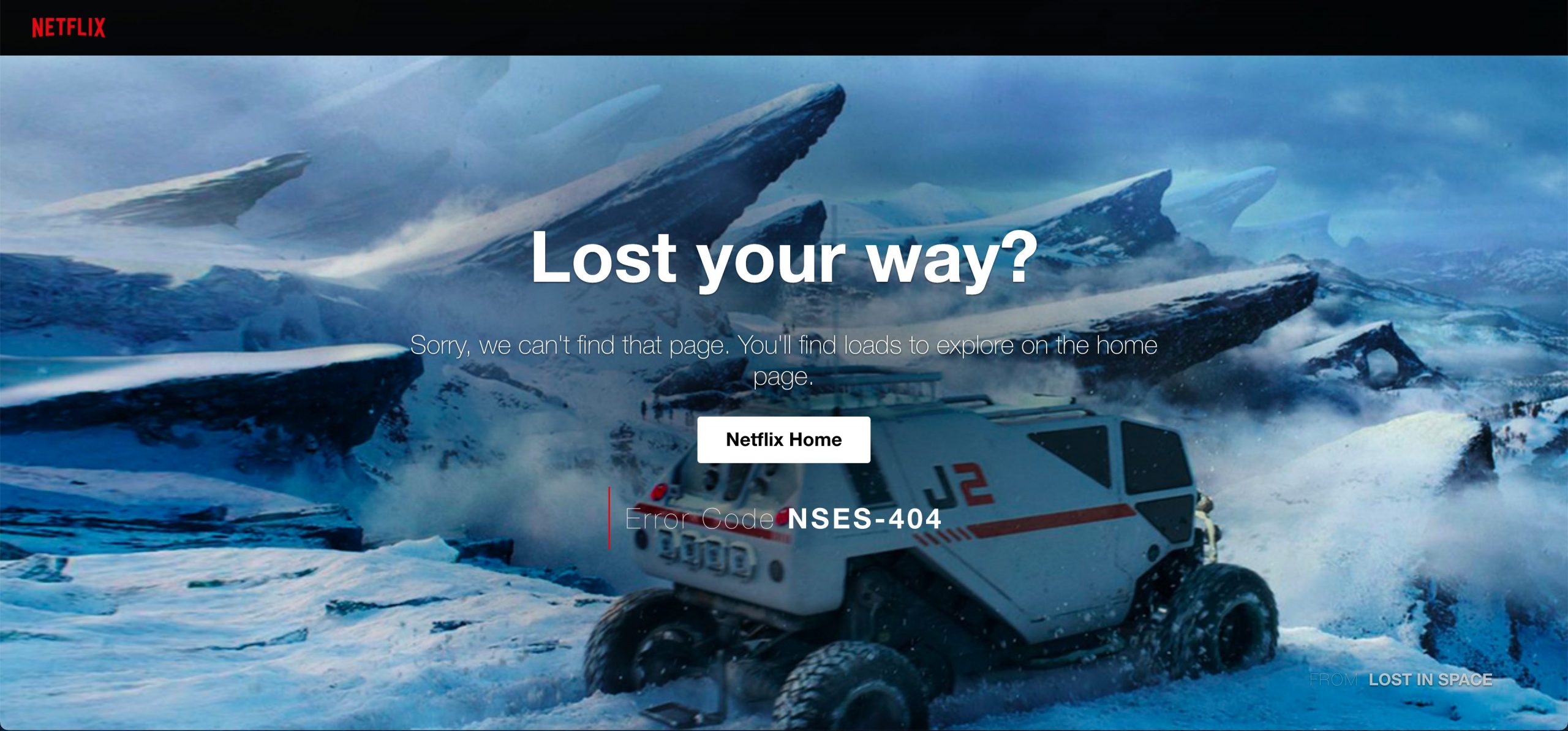
Netflix’s page stays on-brand by showing a shot from one of it’s original shows; Lost in Space
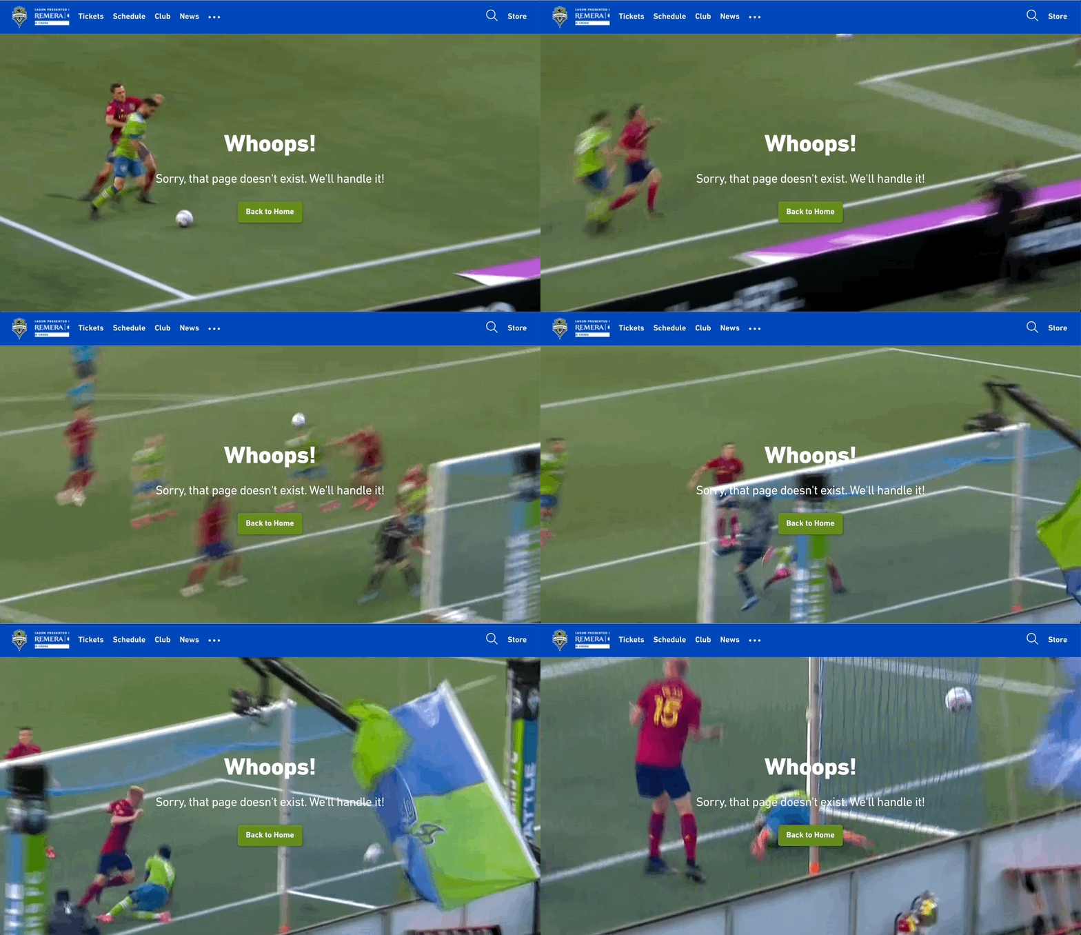
 MLS team Seattle Sounders‘ ‘oops’ page pokes fun at a rival team’s own goal with a full-page gif
Stuck for ideas?
We have plenty! Drop us a line at hello@vidacreative.co.uk or pick up the phone to 0191 691 1293 – we’re happy to help.

