In this blog series we speak to some of our favourite creatives to find out the stories behind their work. This time we talked with lettering artist Ashley Willerton.
Ashley Willerton is a traditional sign writer and commercial lettering artist based in Newcastle-upon-Tyne. His client list ranges from small Newcastle cafés to national work with the likes of Fortnum and Mason and The Independent.

What first inspired you to get into sign writing and bespoke hand lettering?
I was first introduced to hand lettering, as a craft, when I discovered Jessica Hische’s work in Grafik magazine. This was all the way back in 2012 and I was a web designer at the time. I’ve always had an interest in typography but it was this article that really made me want to delve deeper into the craft and figure out the inner workings of letterforms and layout.
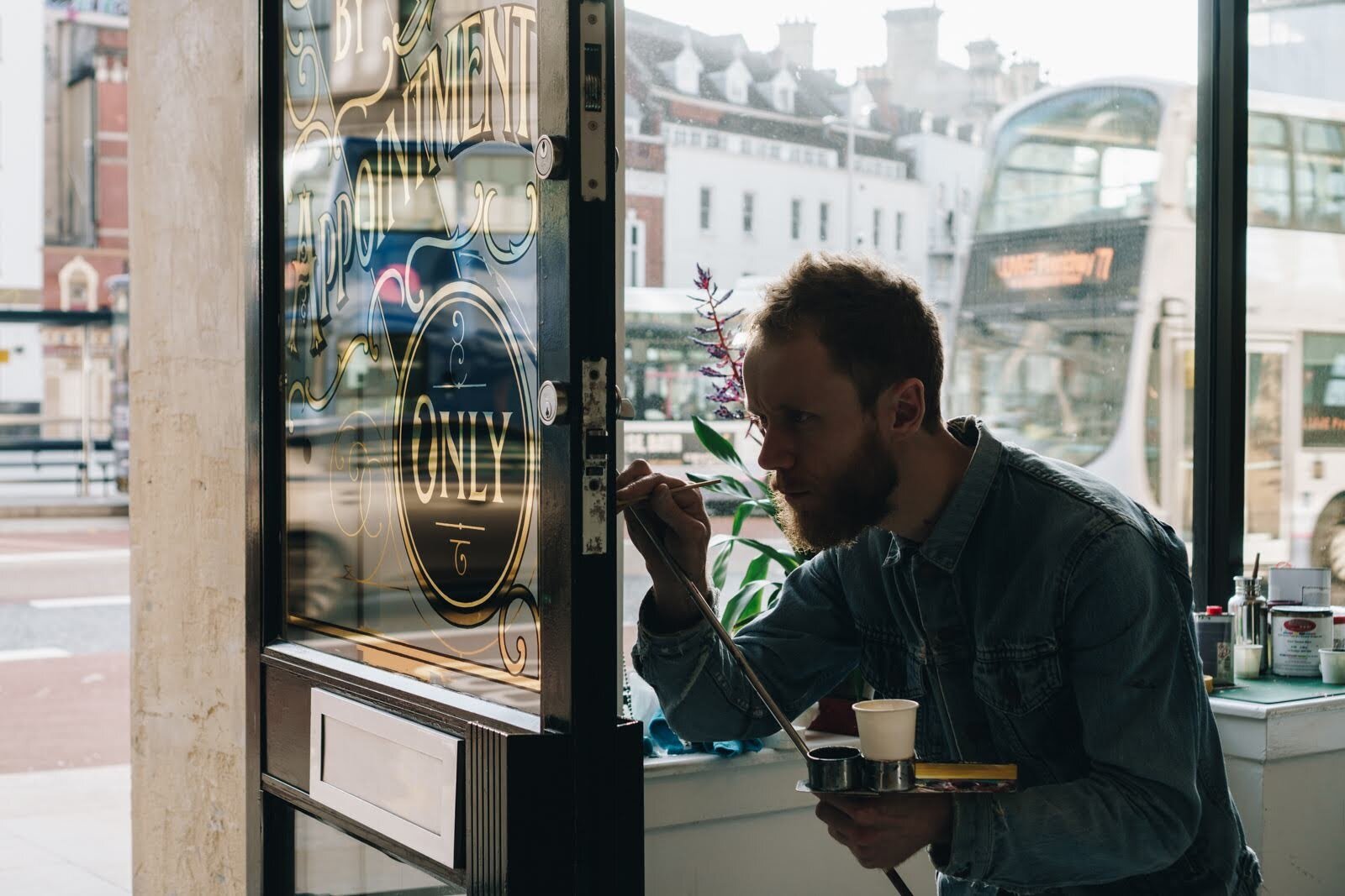
My interest in signwriting happened a bit later and kind of by accident. I was asked to produce one of my lettering illustrations in a window in the centre of town and I had no idea how to do it. After a bit of research, I found that lots of people were using posca pens to transfer their work to glass. From here I began looking for more permanent ways to produce my designs and this is when I fell upon the cult film – Sign Painters by Faythe Levine and Sam Macon. This film was without doubt the biggest inspiration for me to begin working with a brush and paint and I’m confident that a generation of sign painters may never have taken up the craft had it not existed.
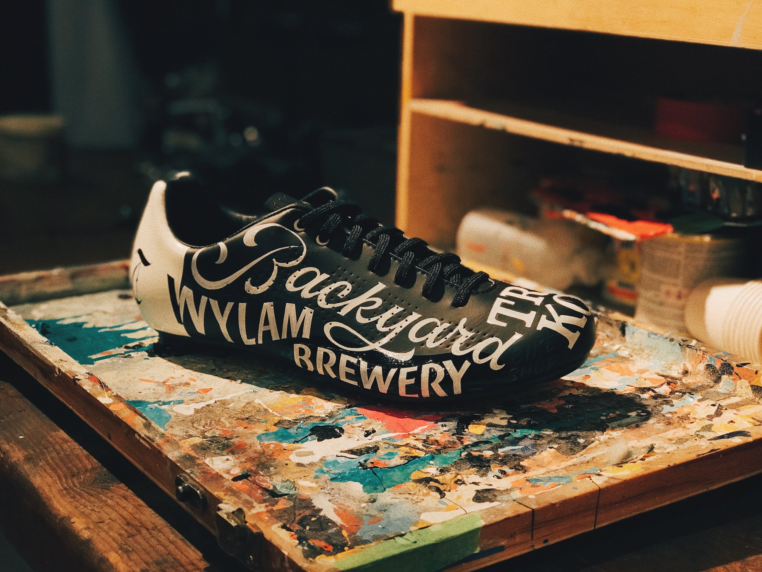
You’ve picked up some amazing clients with the likes of Fortnum and Mason and The Independent most notably, is there a particular project that you are most proud of in your career?
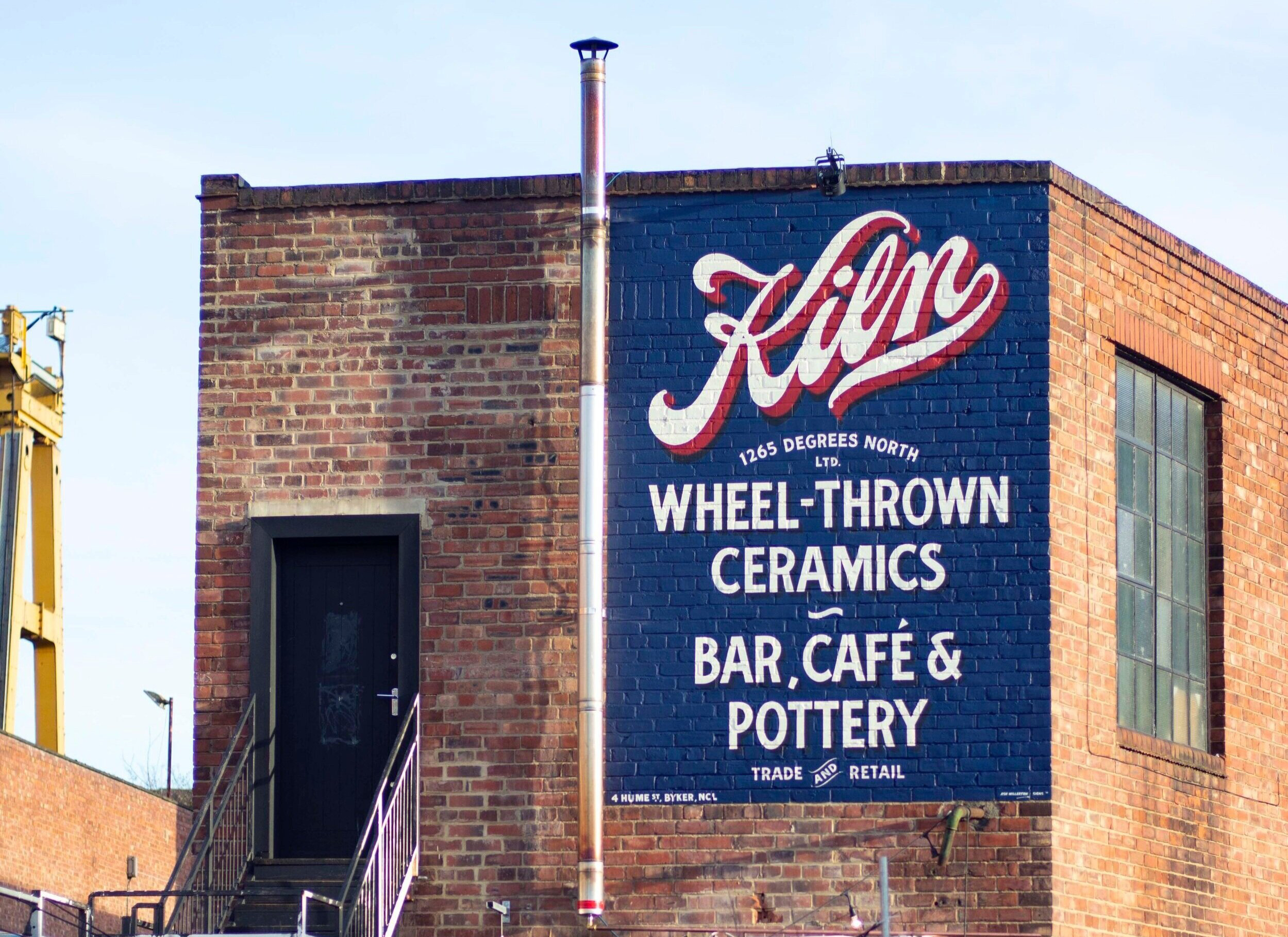
The project I’m most proud of is probably the Kiln wall sign in Byker. This is the biggest sign I’ve produced on my own and it’s led on to some really great opportunities. I remember it being really windy on the scaffold and a bit of battle to get it all complete before the scaffold had to come down. It feels like I overcame a lot of obstacles on that project so it holds a lot of significance. It’s also the only sign of mine that I see everyday on the way to the studio so I’m relieved that I still like it 4 years on!
You are represented by Good Illustration Agency, how has being represented by an agency helped develop your career?
It’s helped enormously. All of my agency commissions are for commercial projects for bigger brands which has given me some great exposure and a great understanding of the pressures of bigger jobs. I like the variation that this type of work offers as it’s constantly pushing my skill set and keeping me on my toes.
You recently collaborated with Novak Collective, for the North of Tyne, Under the Stars exhibition, how did that collaboration come about, and how was the project?
This came about from the Novak guys being aware of my work through instagram. They had worked with the same couple of artists on their previous installations but wanted to work with six local artists to create their Under the Stars piece. I was fortunately one of the six and it turned out to be one of the most interesting projects I’ve worked on in ages. I’ve never done anything like it before and had no idea how my work would translate in this medium. What they did with everyone’s work blew me away and I’m definitely keen to work with them again in the future.
You worked with Fontaines DC on creating artwork for the release of their new album, in addition to the album cover lettering, you also worked on painting the track list, which included designing a full alphabet for use across the campaign. How did that project come about?
The Fontaines project came from the album’s art director who I’ve worked with previously on a couple of projects. I’ve loved the band’s previous two albums so this really was a dream commission. I worked closely with the band’s guitarist, Carlos, who knew exactly the style of lettering they wanted and then I set to painting it. It was a lot of pressure working with a band you’re a fan of but I couldn’t have been happier with how it all turned out.
What advice would you give for aspiring creatives and artists, and those who are graduating this year?
Go out there and get seen. Be a pest (a nice one though), ask questions, stay up late and practice what you’re passionate about. I remember getting home from my day job as a web designer, grabbing some food and then drawing into the wee hours. It was these nights where I was really figuring it all out. I lettered it all, from world cup fixtures to my dog’s name. No word was safe!
It sounds trite but get as much experience as you can and try not to let rejections or setbacks define your ability. There’s a long road ahead! I have a print on my studio wall by Anthony Burrill that reads Persistence is Fruitful. It’s a simple mantra that will get you far in any pursuit you undertake in life.
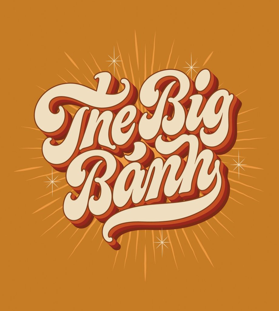
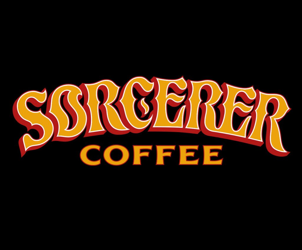
All creatives have different approaches to receiving a brief or starting on a piece of artwork, do you have a typical process for when creating your illustrations?
My process usually begins by putting down the phone to the client and frantically sketching down ideas on the piece of paper that’s closest to me. Over time I’ve realised this is just to convince myself I can see a direction for the project. It enables me to compartmentalise it in my head. If I leave it too long, I end up with too many ideas floating about and it becomes difficult to visualise where to go with it. The end product usually never ends up like those initial scribbles but it’s kind of the first brick of the house. Once that’s down, I know we’re at least heading somewhere!
From here I spend a lot of time refining, ruminating, researching and podcast listening. I haven’t migrated to the ipad yet so all my work begins with pencil paper. I really enjoy the immediacy of this way of working and I love being away from a screen if I can. It takes a bit longer overall but it’s probably the stage I enjoy most. I like the problem solving aspect of the initial sketches and seeing them come closer and closer to a finished piece that you feel works.
Where do you tend to get your inspiration from?
I usually get my inspiration from old lettering books. There’s so many weird and unusual ways to draw any given letter and these books have some of the best examples. Sometimes it will just take one letter to inspire the style of the word.
What would your dream project to work on be?
I’d love to work on a whiskey label. That’s been my dream project from the get go so I’m hoping to make that happen soon!
What are you currently working on, any projects in the pipeline?
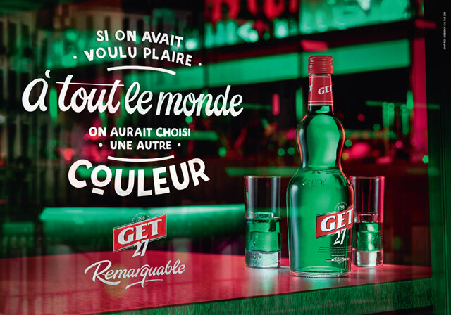
I’m working on lots of cool projects at the moment. Kiln’s new restaurant in Edinburgh called Patina, long standing clients Kafeneon and another album cover for a band that I’m not sure I can name right now are the current projects in rotation.
This series is all about putting the spotlight on different creatives, are there any creatives who you have recently come across that you would recommend?
I’m pretty bad with keeping up with what’s new in the creative world as there’s so much happening! I don’t really have any underground tips in that sense but a creative who has helped me from the very beginning and is now at the top of his game is Newcastle artist Ryan Quickfall aka Ryan Roadkill. Me and Ryan used to share a studio together when I was first starting out and his work ethic is off the charts. Ryan has definitely been a big inspiration over the years and he no doubt will continue to be for the next generation of creatives coming through.
Thanks Ashley!
It’s been great to hear about your inspirations, along with learning the origin of some truly fantastic collaborations. If you’d like to see more of Ashley’s work, be sure to give him a follow and check out his site.
Stay tuned for more creative spotlights, we’ll be back with another instalment soon! In the meantime, you can see what we’re up to on Twitter and Instagram.
