Although in the marketing world data isn’t everything, it can give you lots of powerful insights that you wouldn’t otherwise have.
Used in the right way, your data can make for some pretty convincing marketing activity too.
Data visualisation is a super effective way to turn those numbers into something that catches the attention of your audiences, and lucky for you we’ve got some niiiice examples to show you.
Spotify
Spotify is the master of data visualisation and using insights to create a personalised experience for its users.
Spotify Wrapped
At the end of each year Spotify does ‘Spotify Wrapped’. It gives you stats like your most played album, the artists you discovered that year, and in the 2019 version it gave the artist you streamed the most over the past decade.
You get a personalised animation which shows you all of your results and Spotify also creates you a playlist with all of your favourite tunes from the year.
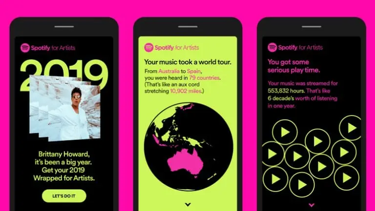
We love the way they used data visualisation to create a personalised experience for users. Because who doesn’t want to be reminded of their favourite tunes of the year?
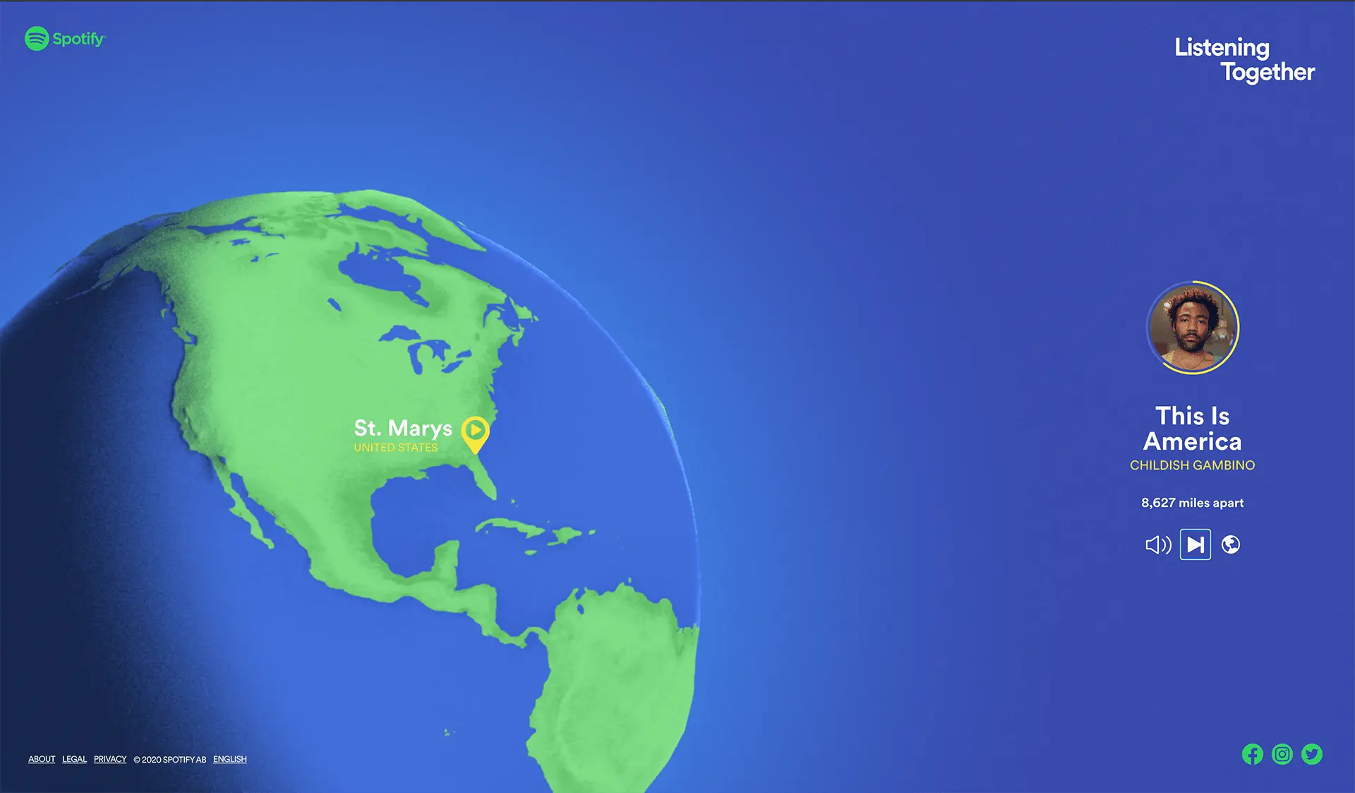
Listening Together
More recently, Spotify released their ‘Listening Together’ campaign after revealing that every second over 30,000 Spotify users press play on the same song. Crazy, right?!
Again, this data is pretty cool because of the way it’s presented. You’re able to imagine some of these connections through the interactive data visualisation that shows you where in the world people are listening to the same song as you at the same time. Check it out here.
Starbucks Data Wall Experience
As a general rule, the Italians are very proud of their coffee (and rightly so – it’s delicious!) and like to support their local independent coffee shops. So, for a major corporation like Starbucks to integrate into Italy’s coffee market, they needed to do something pretty special. And that’s exactly what they did…
The first Starbucks in Italy opened in Milan in 2018, inside the historic Poste building in Piazza Cordusio. There are so many things that make it stand out (including the sheer size of it!) but we’re talking about their ‘data wall’.
Data visualisation studio, Accurat, developed a massive, augmented-reality-enabled brass wall to depict the history of Starbucks.
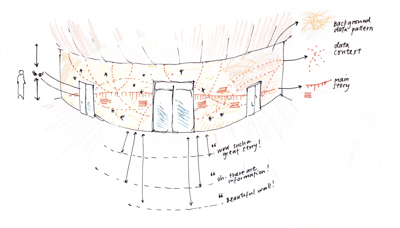
The wall is pretty impressive just on its own, but thanks to a partnership with MONOGRID (a digital interactive studio), the wall has a digital layer that interacts with the physical space. It’s activated by the Starbucks Reserve Roastery Milano app that’s available to download. So cool!

Giorgia Lupi, Co-Founder of Accurat, has written about the process of creating this wall on her site. If you’re interested, you can read it here.
Giorgia Lupi Data Fashion
Speaking of Giorgia Lupi, next on our list is her data fashion collaboration with & Other Stories to celebrate women in science, environmentalism and space.
Lupi is known for her artistic angle on data, and with this fashion collab she turned data visualisations into wearable stories that are super detailed and creative.
She designed various garments that are now sold inside a bag she also designed, where both the data and the inspiration behind them are explained. But she also explains some of her reasoning in this video, for those of us who haven’t got our hands on these funky garments.
Data visualisations you can wear? We love it!
Information is Beautiful
Our next pick is an entire Twitter feed dedicated to data visualisation – 111k followers strong!
They post different data visualisations regularly, and retweet cool ones from other people too.
We’d definitely recommend giving this account a follow. 10/10. Very pleasing content.
200 years in 4 minutes
This video from Hans Rosling, a famous statistician and global health teacher, is pretty awesome too.
He animated global health data in ‘real space’ (with the help of his camera crew!) to show the story of the world in 200 countries, over 200 years, using 120,000 numbers! Not that you’d know it because the animation is dead easy to follow.
Why Do Cats and Dogs…?
If you know us, you’ll know we love our pets! Dan and Erin’s cats, Elvis and Hugo, are regular features on our social media. So we love this interactive data visualisation from Nadieh Bremer.
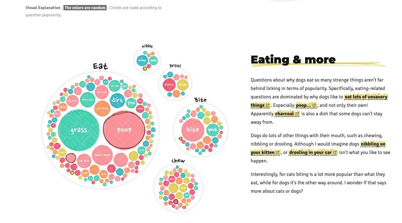
Her animated illustrations visualise some of the most common questions asked about cats and dogs on Google in a lovely creative way. And there are some interesting ones, to say the least!
Check it out here.
So, why bother?
We hope you can see that data visualisation can be super effective. From a content marketing perspective it can be a great tool to get your audience engaged with what you’re saying and create new experiences for them whilst you’re at it.
Feeling inspired?
If you’re new to data visualisation, Google Data Studio is a great place to start. You can build your own reports using your website data (you need to have Google Analytics set up first though).
We use it a lot for client monthly reporting, to clearly illustrate the results of our marketing activity.
If you’d like to know more about how data visualisation can benefit your marketing, get in touch for a chat.