Choosing fonts is a big decision when creating a brand. We spend a lot of time looking at fonts, and we love them! So we’ve decided to write some blogs about the origins of our favourite typefaces.
Of course, it only seems fitting to begin by looking at Futura – the typeface we’ve used in our own logo and wider brand.
In these blogs, we look at the reasons why designers choose a specific type, and the impact these decisions have.
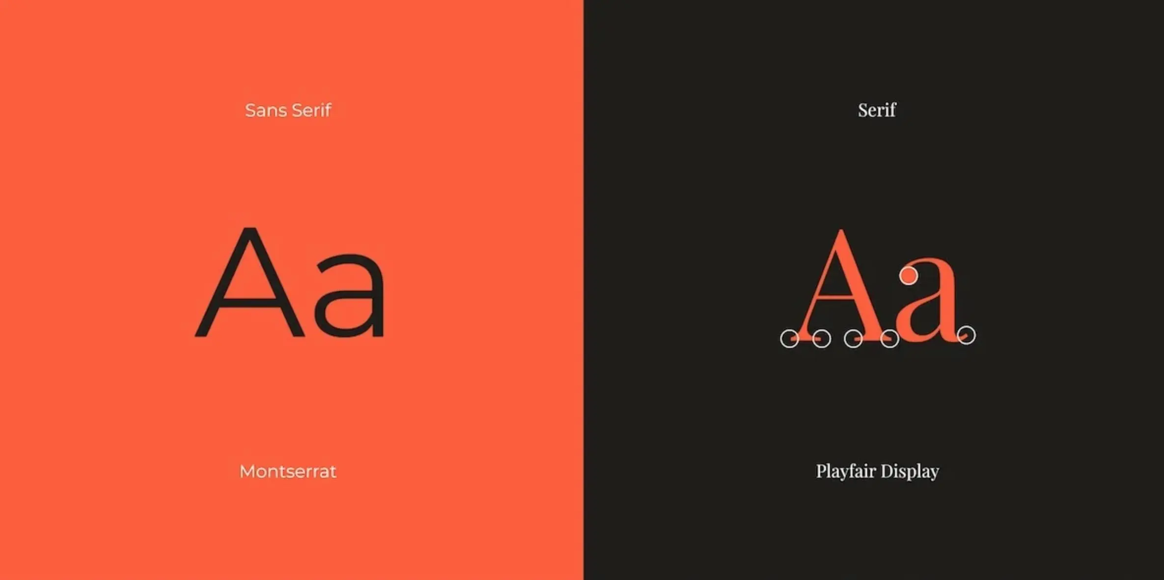
What’s the difference between sans serif and serif fonts?
Futura is a geometric sans serif font that, despite being created back in 1927 by German type designer Paul Renner, is still considered a very progressive, modern typeface.
For those of you who don’t know what we’re on about… A serif is the decorative stroke that ‘finishes off’ the end of a letter’s stem. Whilst a sans serif font, like Futura, doesn’t have these strokes.
Where did the Futura font come from?
Futura is influenced by the hugely influential period of design, Bauhaus. And it wasn’t just typography that took inspiration from Bauhaus, you can see it throughout the wider world of art, architecture, graphic design, and industrial design.
The essence of the Bauhaus design style was function over form. So the Futura typeface was designed using simple geometric circles, triangles and squares – no unnecessary decorative elements. This is why we chose Futura, we like that it’s bold, modern, and to the point!
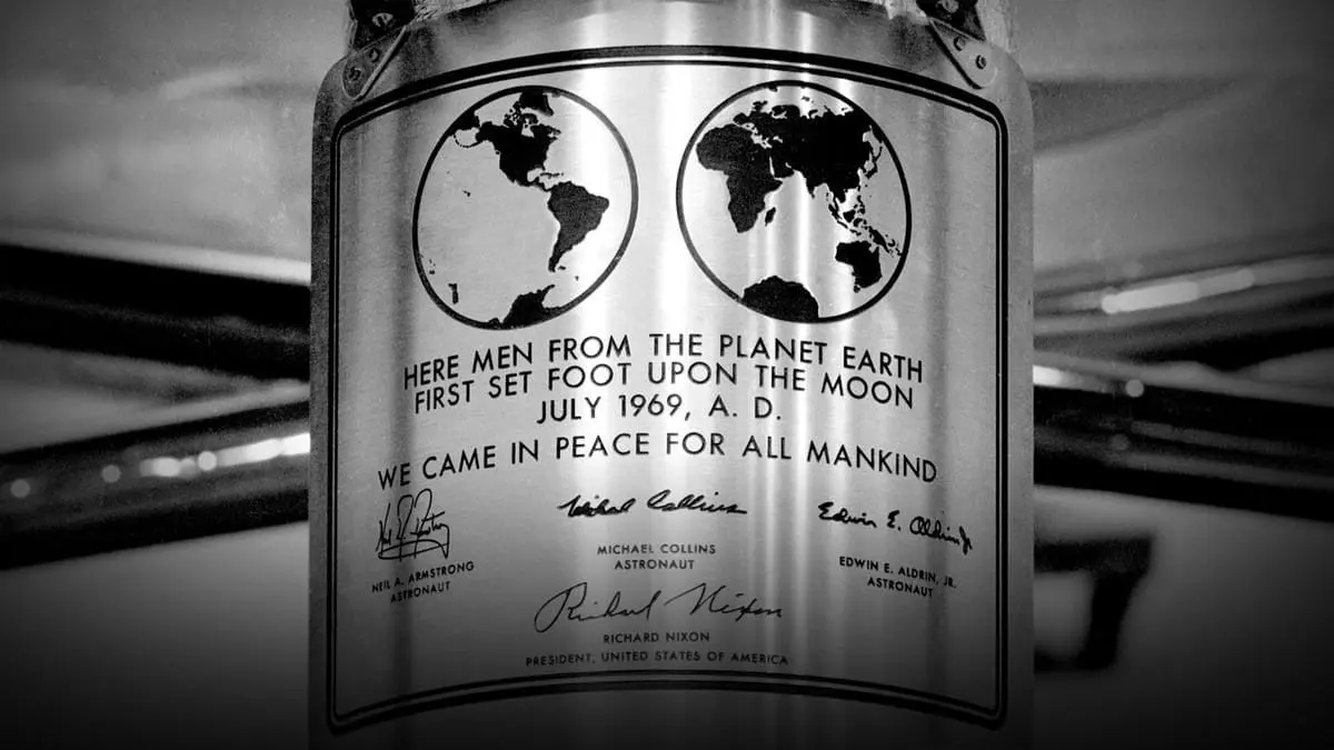
A font so popular it made it to the moon
Futura is one of the world’s best-known typefaces. It’s been used countless times across many different industries including film, advertising, and on an array of album covers.
It’s considered a timeless classic by many in the world of design because of how versatile it is. It’s just as effective as a display type or used as body text.
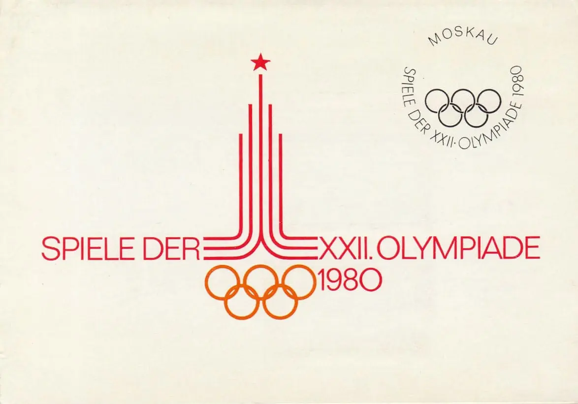
Perhaps its most well-known usage was as the type that was used on the plaque left on the Moon by the Apollo 11 Mission in 1969. Since then, it’s been used extensively in advertising and branding. It’s been used on brands such as Volkswagen, Crayola, Nike, Gillette, The Olympic Games (Moscow 1980), and IKEA to name just a few. Film titles such as American Beauty, Sesame Street, V for Vendetta and many of director Wes Anderson’s films also use the typeface.
Futura’s evolution to Futura Now
This month, the typeface has been refreshed for the digital era, with Monotype’s launch of Futura Now.
Monotype say it’s been released to “meet the demands of ‘digital first’ campaigns” and the changing needs of the 21st century. Futura Now is the most accurate depiction of Renner’s original idea, but with a “digital-first” edge.
The new typeface consists of a far wider amount of styles, and support for 89 languages…
Want to chat fonts or branding?
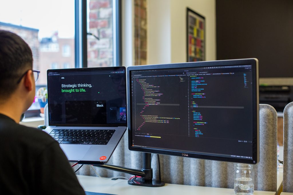
We create innovative brands for forward-thinking businesses. If your brand needs a refresh, get in touch for a chat by emailing hello@vidacreative.co.uk.