Choosing a typeface for a project is a key part of a designer’s process at the best of times. But when it comes to choosing one to help commuters navigate a complex and evolving transport system, then it’s of fundamental importance. In this blog, we’ll look at Johnston Sans, the typeface that first gave London its unique and individual identity. And how it has stood the test of time in the process.
A design for commuters and visitors
In this blog, we’ll look at Johnston Sans, the typeface that first gave London its unique and individual identity. And how it has stood the test of time in the process.
For the past 100 years, there have been wide-scale developments across the London Underground. New routes, new stations, new trains. But one thing that’s remained is the font used to navigate Londoners and visitors around the city.
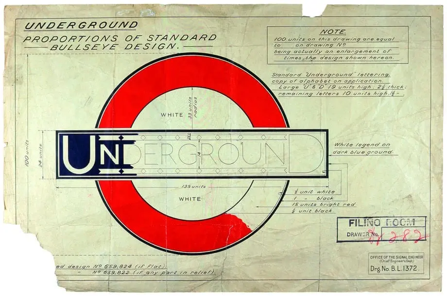
The font, Johnston Sans, has therefore become one of the world’s most iconic typefaces. Its origins begin in 1916, when London Underground asked calligrapher Edward Johnston to create a new typeface for its posters and signage. Johnston was commissioned to replicate “the bold simplicity of the authentic lettering of the finest periods” whilst ensuring it “belongs unmistakably to the 20th century”. The typeface was commissioned to be distinctly different from the lettering used in advertisements of the era.

The London Underground Roundel
For the past 100 years, there have been wide-scale developments across the London Underground. New routes, new stations, new trains. But one thing that’s remained is the font used to navigate Londoners and visitors around the city.
The font, Johnston Sans, has therefore become one of the world’s most iconic typefaces. Its origins begin in 1916, when London Underground asked calligrapher Edward Johnston to create a new typeface for its posters and signage. Johnston was commissioned to replicate “the bold simplicity of the authentic lettering of the finest periods” whilst ensuring it “belongs unmistakably to the 20th century”. The typeface was commissioned to be distinctly different from the lettering used in advertisements of the era.

An icon of the city and beyond
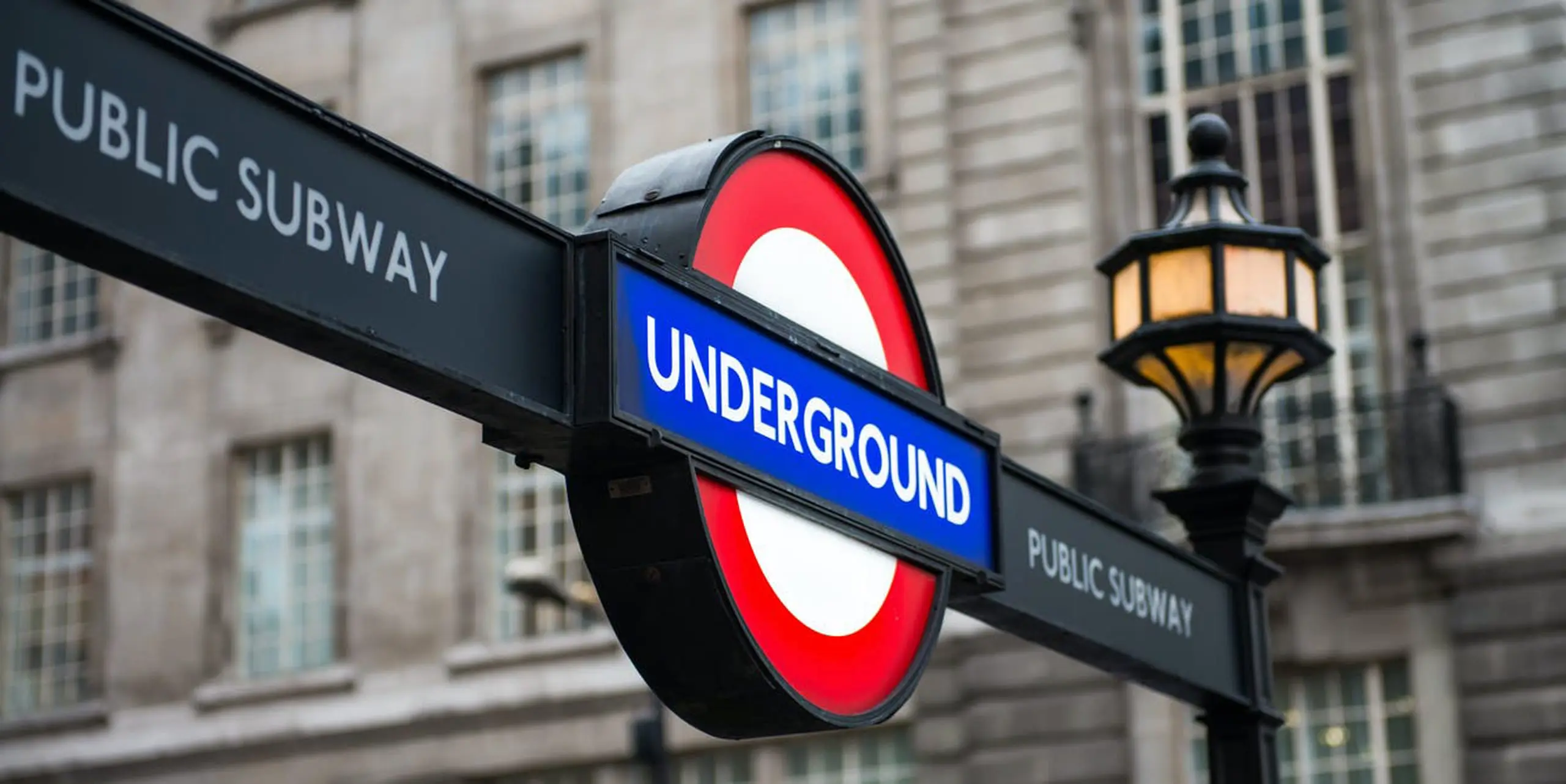
London is a city rich in icons. Buckingham Palace, the London Eye, Big Ben and the Houses of Parliament are all established tourist attractions. And from a design perspective, the Johnston typeface and London Underground identity sit firmly alongside these.
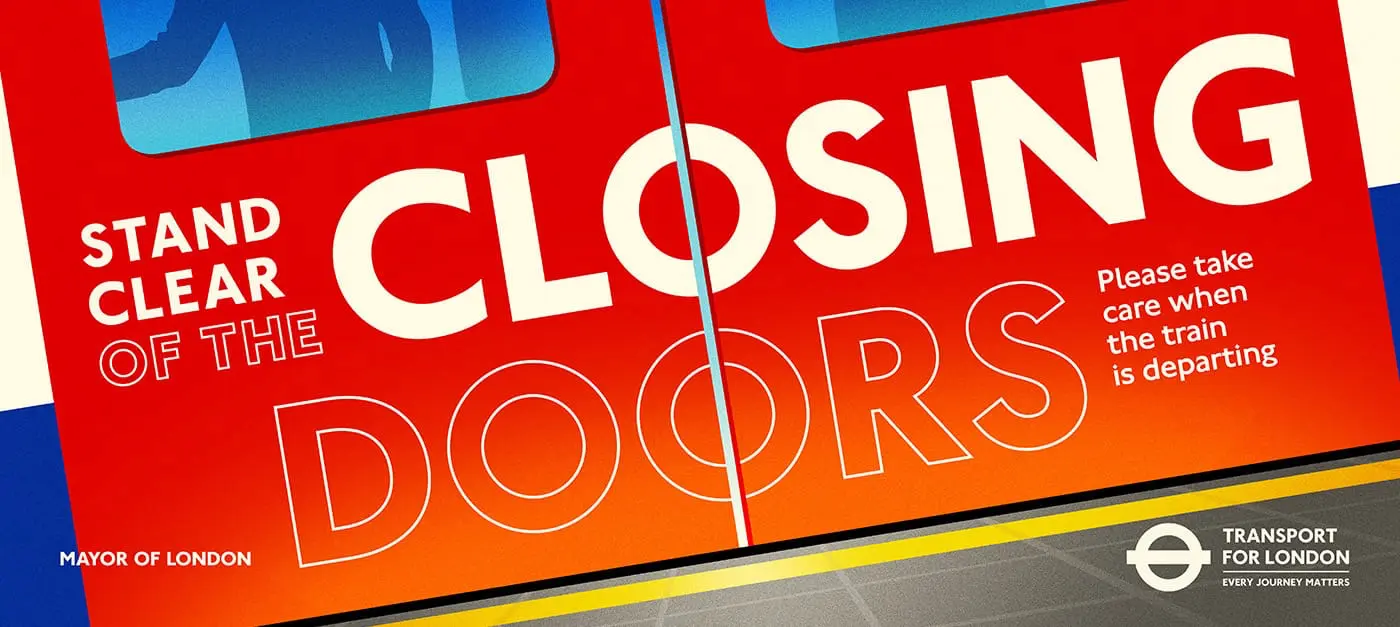
The typeface is used, not just across the cities transport networks of buses, trains, trams, boats, cycle paths, but also on the Mayor of London’s branding. It really does work to sell the city to the rest of the world.

Travelling in a new direction
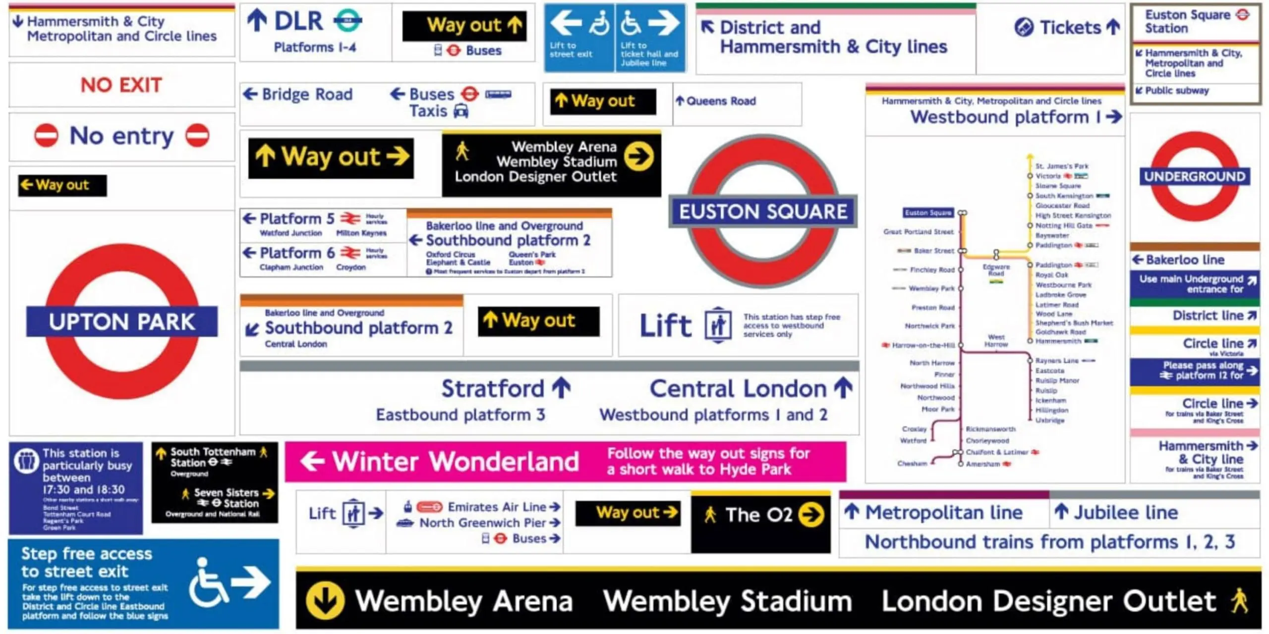
Before the introduction of Johnston Sans, the Underground used various typefaces This resulted in a really confusing and complex mismatch of styles. All of the advertising, signage, and map systems used different typefaces, a consistent and coherent design system was desperately needed. Johnston Sans changed everything.
The serif typefaces used in previous years mimicked the calligraphic styles of Victorian handwriting with decorative flourishes. Johnston Sans was created with functionality at the forefront. The type combines beauty and simplicity with readability to aid commuters on their journeys.
In a city of nearly 9 million residents, and around 30 million visitors annually, Transport for London caters to people from all over the world. Information needs to be presented in a way that’s helpful, efficient, and legible enough for quick absorption by fast moving passengers.

Want to chat fonts or branding?
We create innovative brands for forward-thinking businesses. If your brand needs a refresh, get in touch for a chat by emailing hello@vidacreative.co.uk.

