Brownlee Cale
A sustainable approach to
construction recruitment
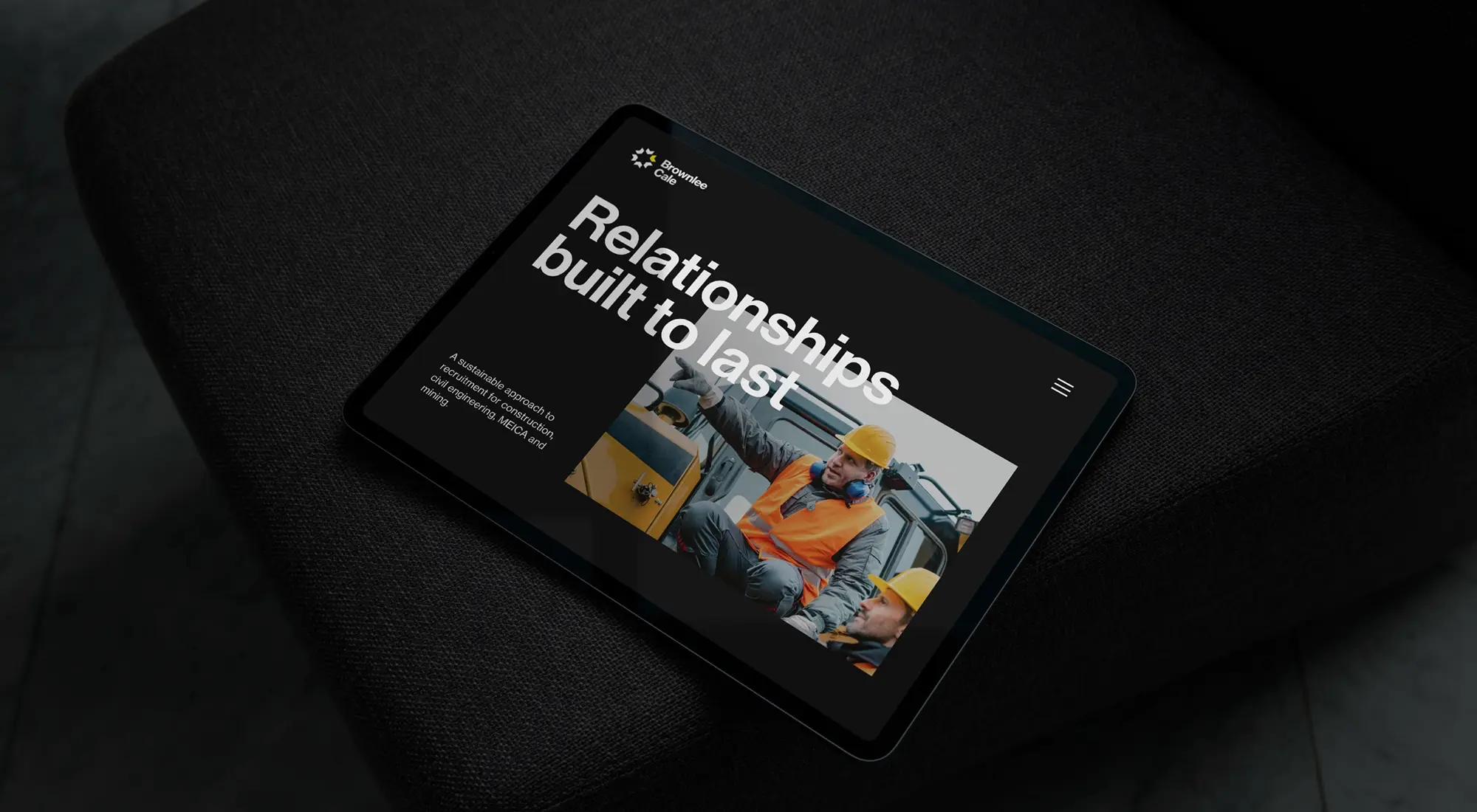
Brownlee Cale is the merging of two leading construction recruitment firms. Previously branded as Brownlee Dean and TSA, we worked with the team on the creation of the brand, right through to a bespoke website and on-going marketing materials.
Client
Brownlee Cale
Industry
Construction Recruitment
Services
- Branding
- Website Design
- Website Development
- Marketing Collateral
From April 2023 to October 2023 there was a 54% increase in organic website traffic compared to the same period in 2022, as well as press coverage in both regional and industry outlets and consistent growth on social media platforms.
54%
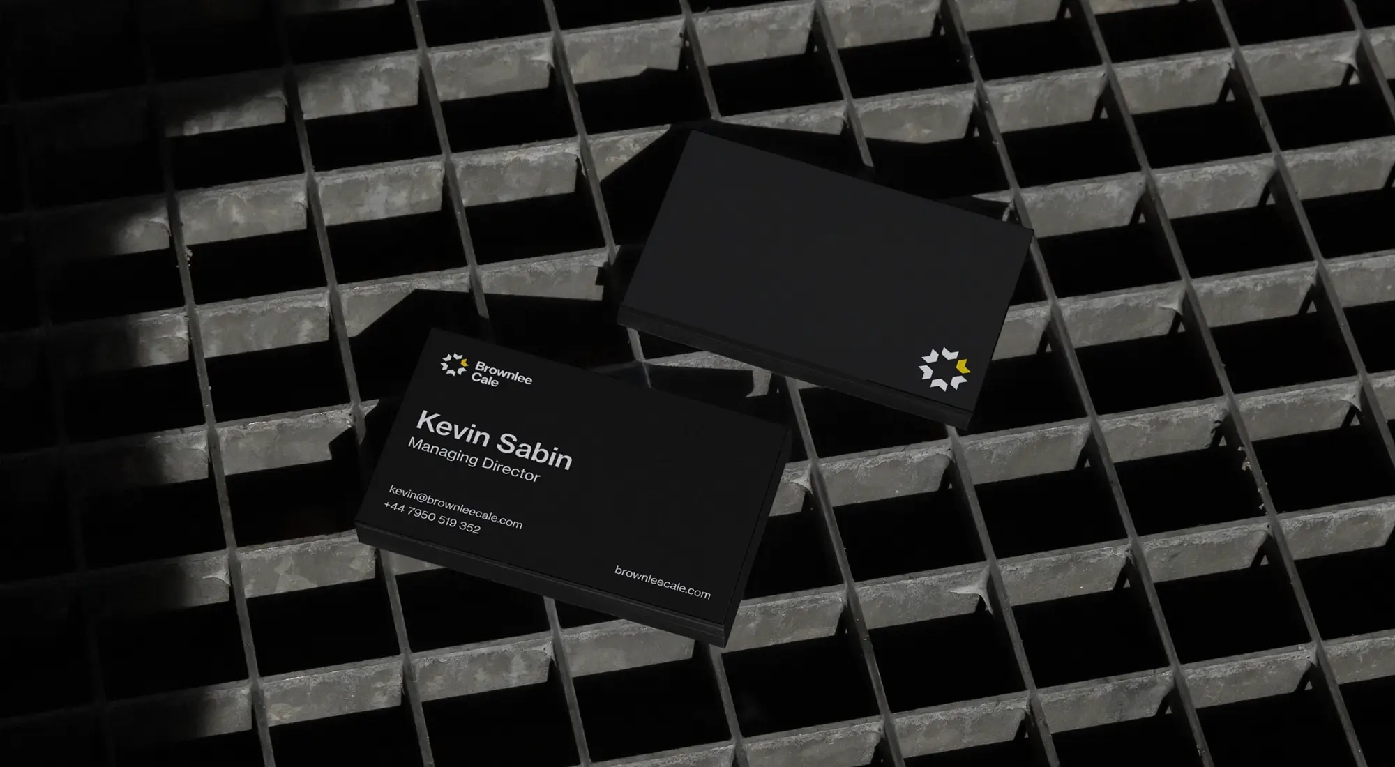
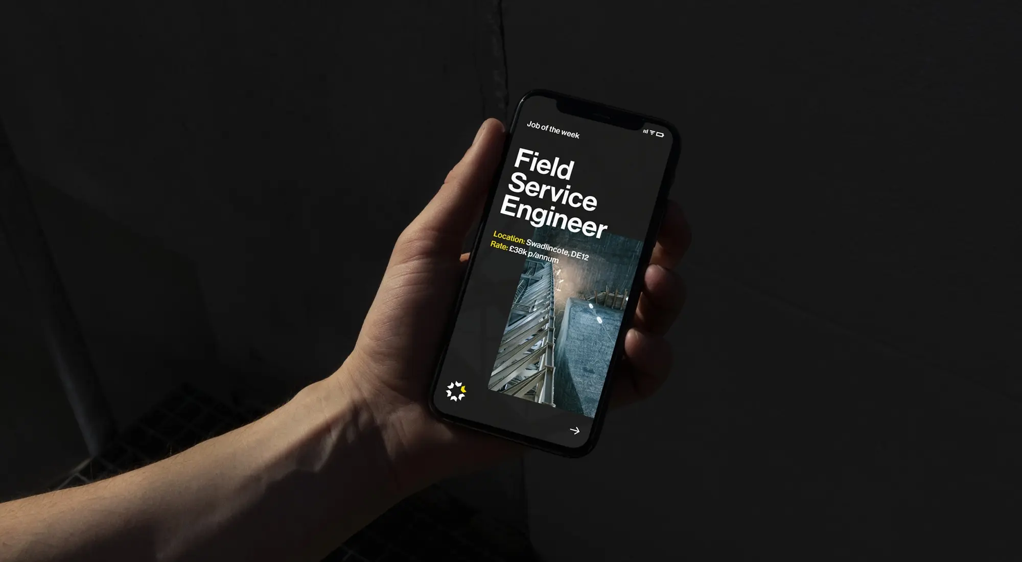
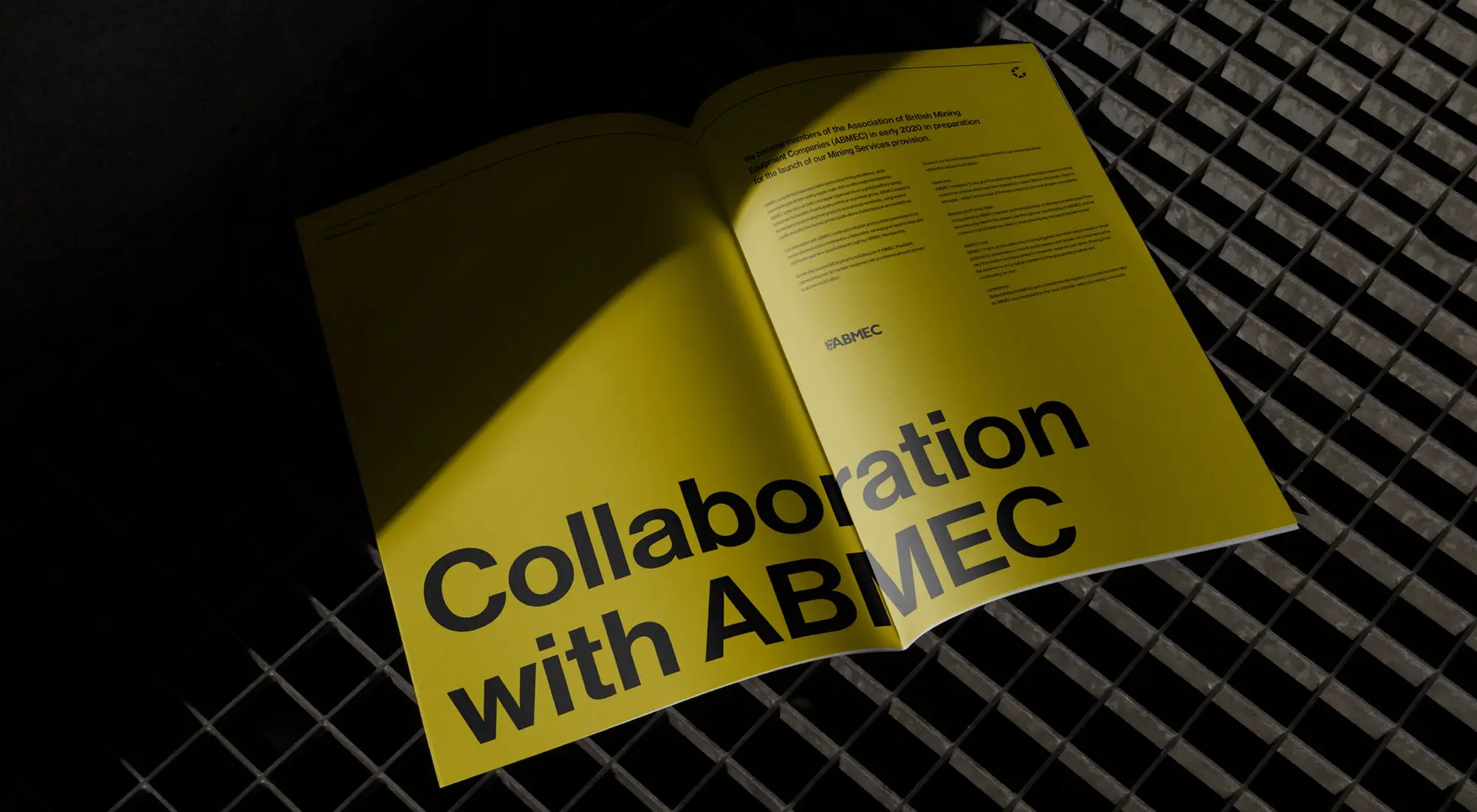
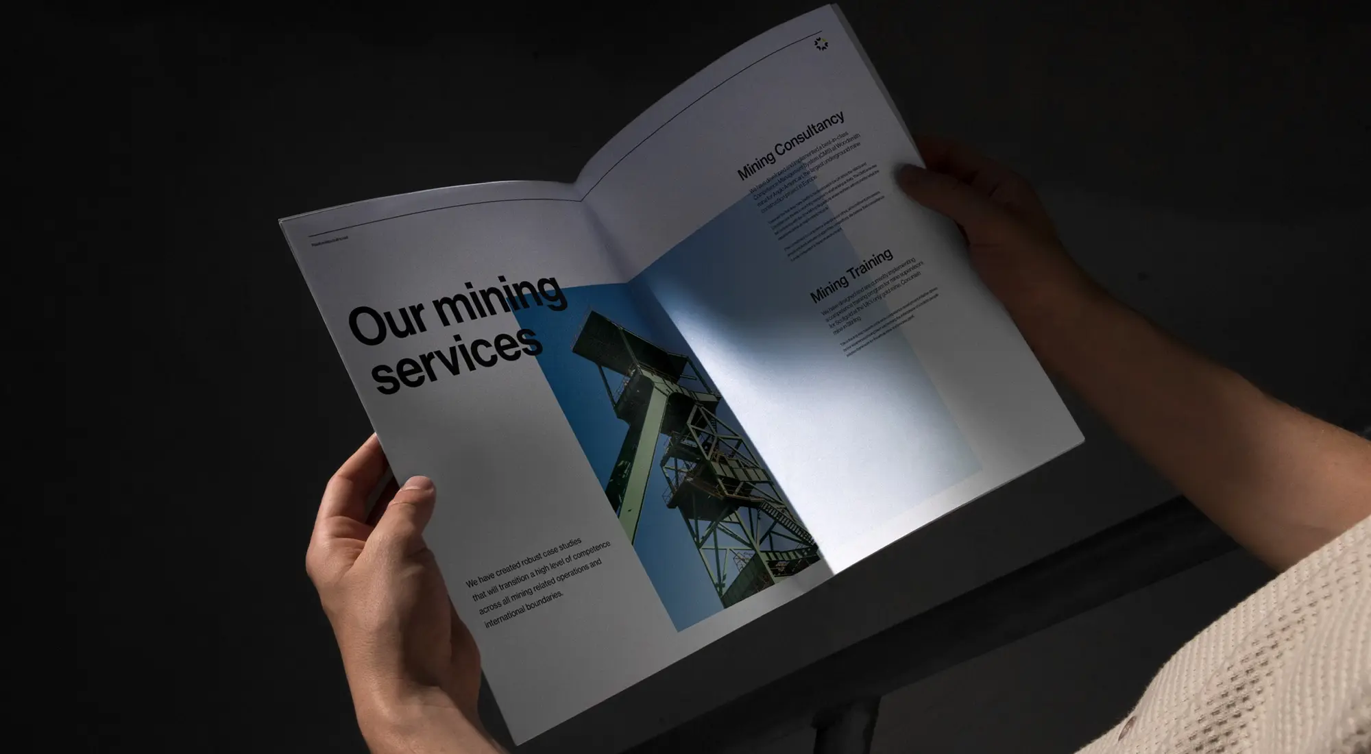
The merger is the joining forces of the two companies, aligning capabilities and sharing resources. Brownlee Cale is a network of cross-industry partners, which we have visually represented in the identity. We gave the Brownlee Cale brand a striking look and feel with a limited colour palette, a bold typographic system on web and in print, across marketing materials and social graphics.
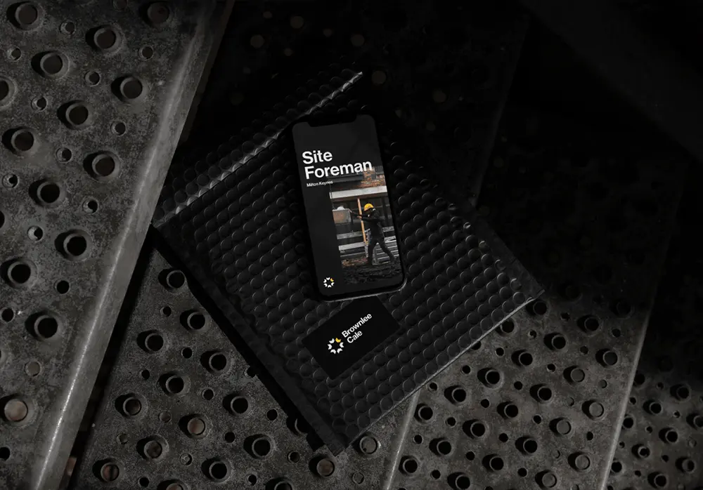
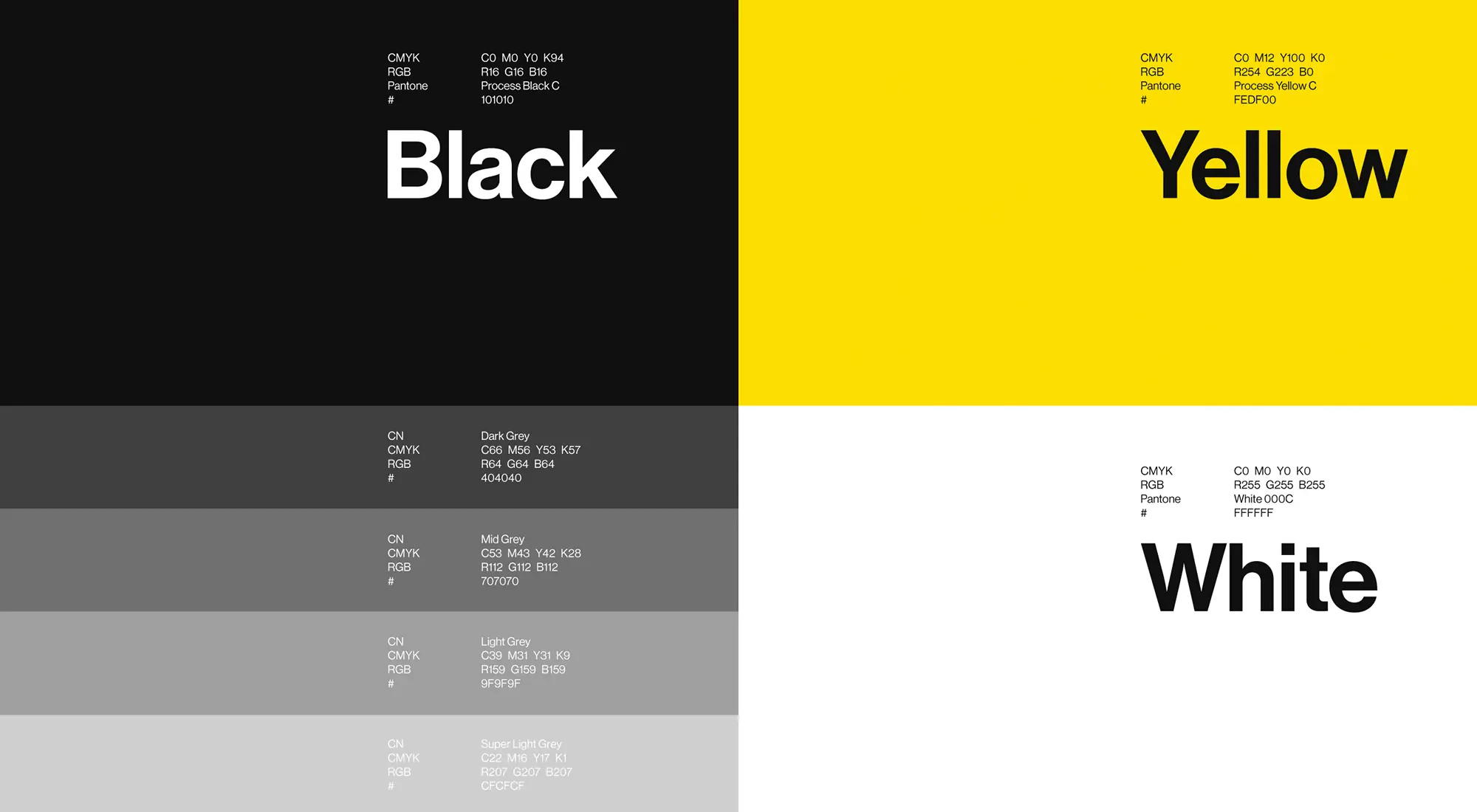
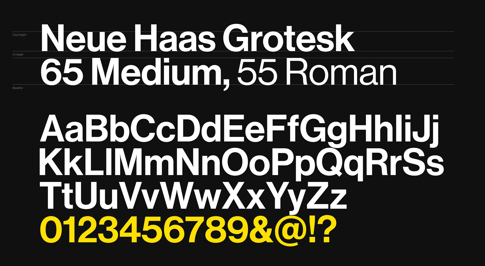
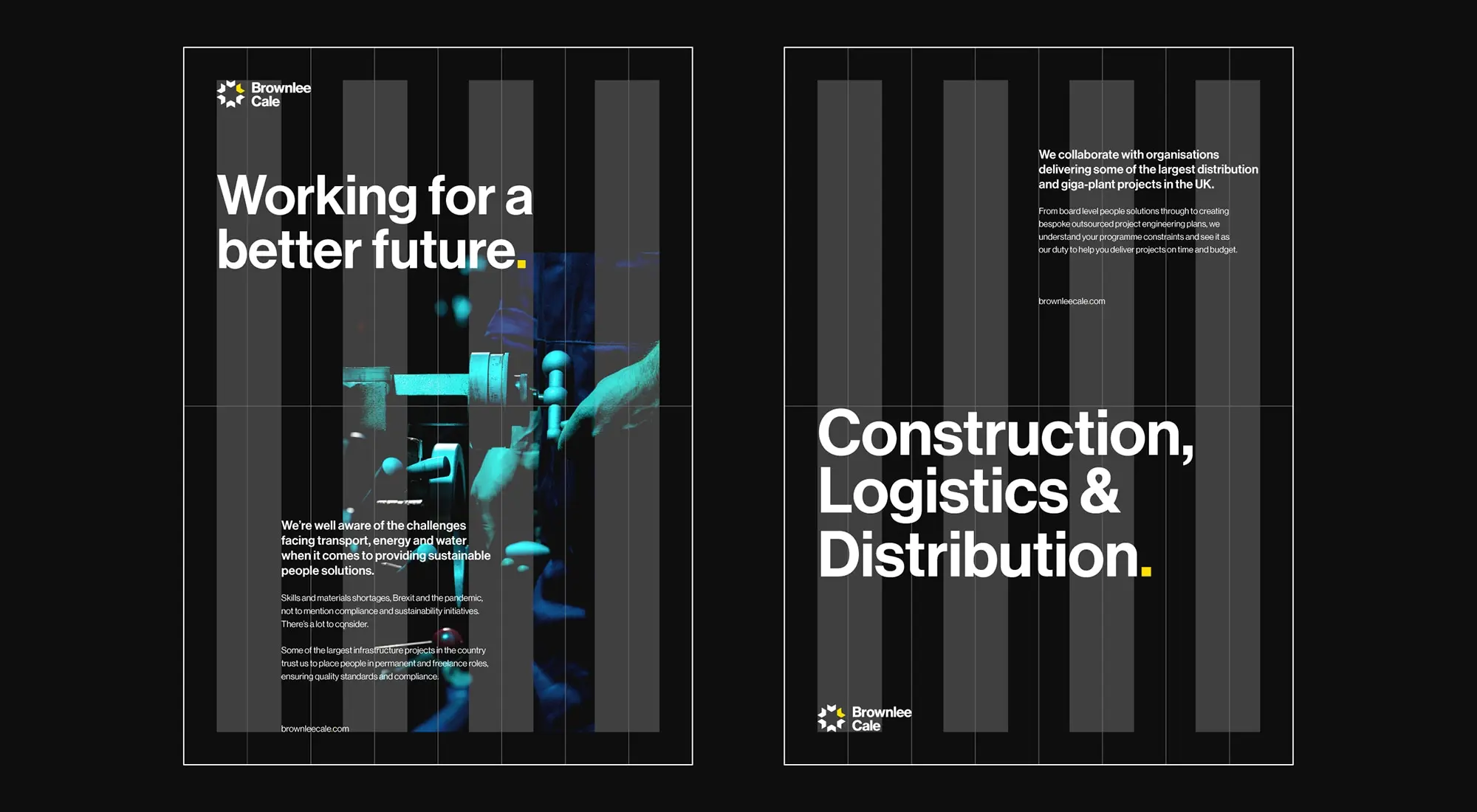
Brownlee Cale’s sectors of expertise include construction, civil engineering and energy. We created a structured icon, alluding to various sectors joining together, using a modern, contemporary typeface. Whilst maintaining the yellow and dark colour scheme of the previous Brownlee Dean and TSA brands, we’ve just tweaked the tones to make it more vivid and stand out more. To follow the structured layout of the identity, we have used large dynamic type and a strict grid structure across the website design.
“Straight talking, friendly and well put together team. I could not recommend Vida more highly for anything branding and marketing related.”
Mark Ingoe
Customer Success Manager
