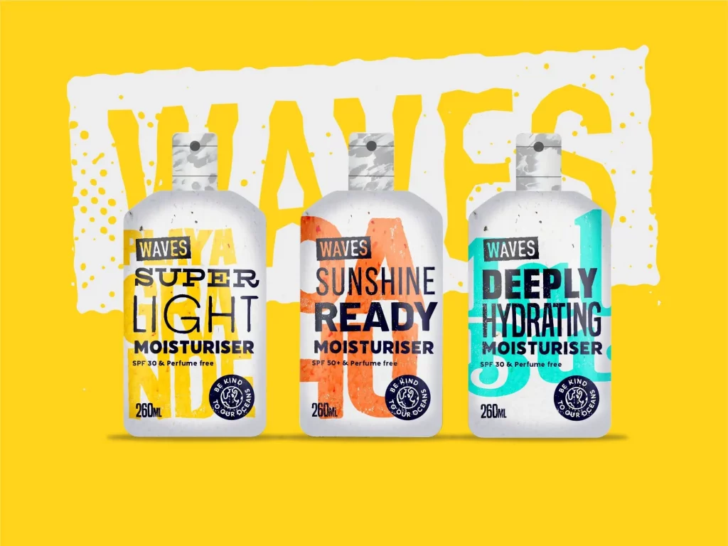
In response to a conceptual brief, Erin's come up with a creative packaging design for a moisturiser from sustainable cosmetics company, 'Waves'.
Jameson Rogan’s conceptual briefs are keeping lots of designers busy at the moment. Our very own Erin came up with a response to one of his recent briefs – a creative packaging design for a moisturiser from sustainable cosmetics company, ‘Waves.’
Here’s what Erin had to say about her response, as well as some insights into the design process…
One of the ways I’ve kept myself busy during my spare time in lockdown is to work on some conceptual briefs. I usually find it easier to work from a brief someone else has written, as it keeps me more focused!
I decided to challenge myself to create a response to a brief from @keep.it.brief – an Instagram account created by Jameson Rogan, a graphic designer from Teesside. Jameson posts a random design brief each week, and last week the challenge was to create some moisturiser packaging for a sustainable cosmetics brand called ‘Waves.’
The design brief
https://www.instagram.com/p/CACyPcYBBqh/
The brief felt quite open and I quickly started jotting some ideas down for my creative packaging design. As a challenge, I didn’t want to spend much more than an evening nailing down the initial look. After a couple of rough iterations, I landed on my chosen style and tone.
Every brand should tell a story
I find brands that have a theme and story to them much more intriguing, and I decided my brand should have been created by surfers who want to see our oceans free from plastic waste. The packaging would be created from 100% recycled ocean plastic and the type used on the packaging should feel “found”, mixed up and a little battered, as if the text itself had been recycled too.
The overall tone I went for felt rebellious and a bit sporty. Surfing is quite an extreme sport and the product itself would be perfect for those who find themselves outdoors a lot.
The product variations were based off iconic surfing locations in warmer climates. I used a load of bold lettering and vivid colours to inject the feeling of brash heat and energetic summer sports.
The overall look I went for was reminiscent of layered screen prints and collaged-together elements. The locations featured are perfect for surfing, but they can only stay perfect as long as we keep plastics out of oceans too.
completing more small challenges like this one too!
See my full entry here:
https://www.instagram.com/p/CAOb_5BACJ8/
Other creative responses
I also wanted to feature some of my favourite responses to this same brief too:
https://www.instagram.com/p/CAP0I63BbhA/?igshid=1hn5hxzyjomft
These very moody and beautiful designs by @ashleighdussie
https://www.instagram.com/p/CAShjzJBhKR/?igshid=17fw3oijriql
These super awesome motion graphic elements by @matvoyce
https://www.instagram.com/p/CAQbHfhpIMd/?igshid=3mdab0e1luq7
And finally this lovely minimal design by @k8fenton which feels super summery!
Bring your brand to life
If your brand needs reviving or you’re starting completely fresh, get in touch for a chat!