Skip to content
4th June 2026
Web Accessibility: Why It Matters and How to Get It Right
27th May 2026
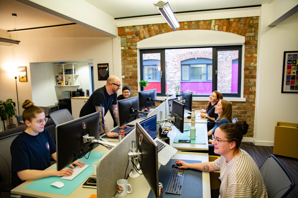
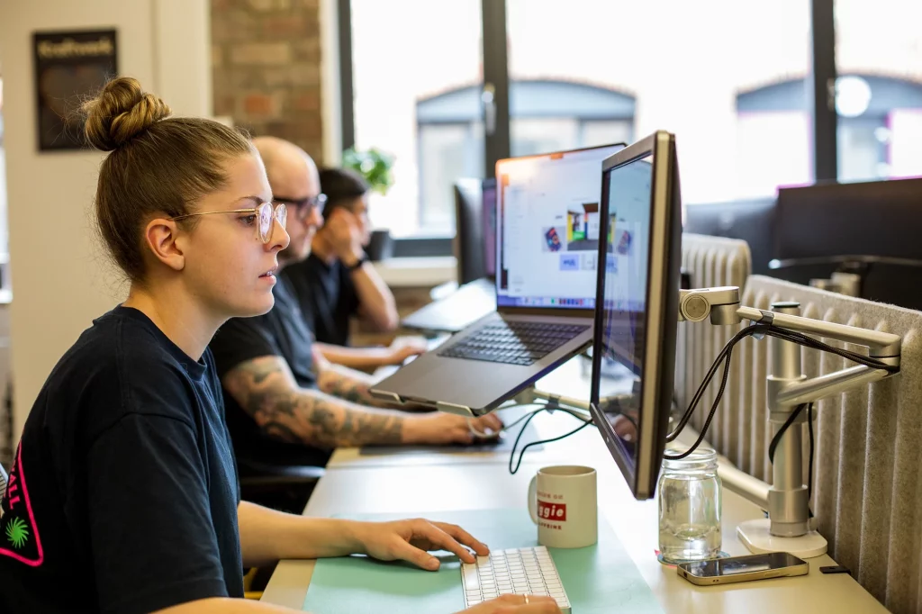
Studio Stories: Jordan Whyte, Junior Developer
25th May 2026
Clear Internal Communications: How to Keep Your Team in the Loop
21st April 2026
Why Every Project Needs a Discovery Phase
16th April 2026
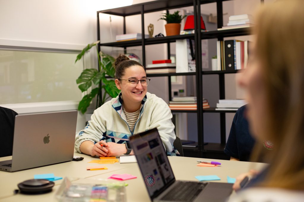
Studio Stories: Beth Gordon, Senior Designer
24th February 2026
We’re Hiring a Front-End Developer
22nd January 2026
Studio Stories: Jay Barber, Content and SEO Executive
10th December 2025
How to Get Your Team Aligned Around a New Phase of Growth
19th November 2025
What Investors Really Want to See in Your Pitch Deck
3rd November 2025
Studio Stories: Chris Stephenson, Design Director
9th October 2025
Beyond the Metrics: The Real Impact of Brand Look and Feel
17th September 2025
The Personal Brand Advantage: Stand Out, Earn Trust, Win Business
4th September 2025
Studio Stories: Rachel Robson, Senior Account Manager
7th August 2025
The Website Briefing Cheat Sheet: How to Plan a Bespoke Build
8th July 2025
Is Your Business Visible in ChatGPT Searches?
27th June 2025
Have You Outgrown Your Marketing Strategy?
30th May 2025
How to Build a Brand That Grows with You
24th April 2025
What to Include in Your B2B Marketing Strategy
27th February 2025
We’re looking for a Senior Account Manager to join our team
30th September 2024
In-house or Outsourced Marketing: The Best Solution For Your Business
5th August 2024
Grant Funding for North East Businesses
18th April 2024
Welcoming Gemma back as Senior Developer
9th September 2023
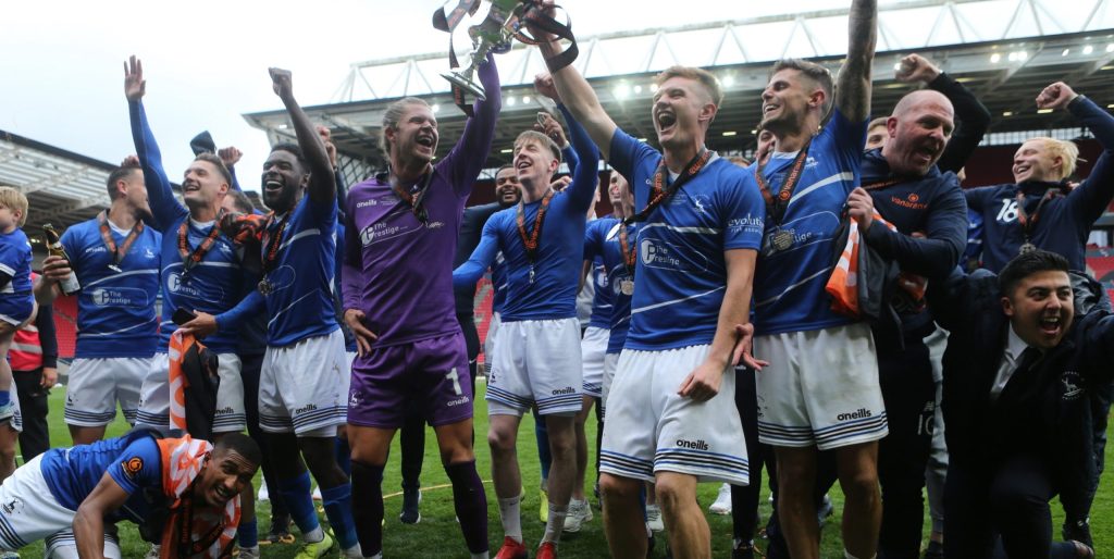
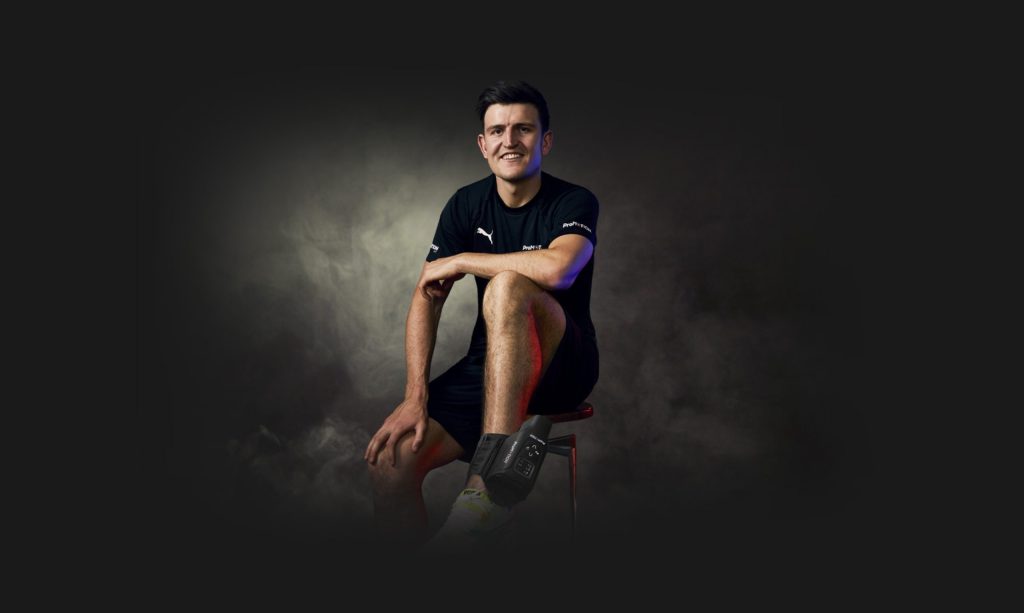
Helping a football club succeed off the pitch
20th June 2023
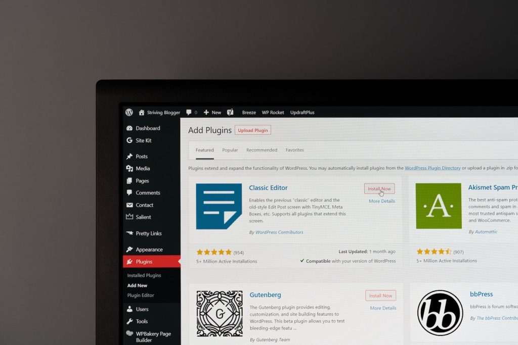
The 8 Must-Have Plugins for Your WordPress Website
30th March 2023
Your New Website is Live… So What?
19th December 2022
5 Brands That Smashed Their Marketing In 2022
23rd November 2022
How to Give Your Brand a Voice that Resonates
21st October 2022
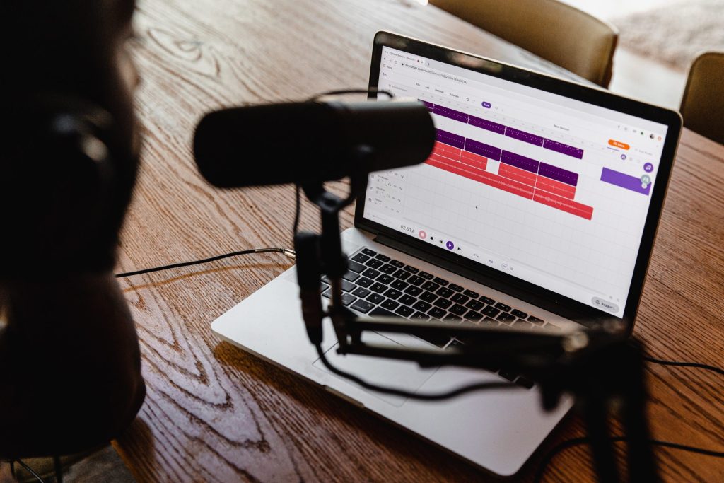
To Cast, or Not to Cast: The Pros and Cons of Company Podcasts
6th October 2022
My Week of Work Experience as a Graphic Designer at Vida
5th October 2022
Marketing and a website launch for Oliver Deacon Coaching
4th October 2022
Creative Spotlight: Q&A with Graphic Artist Anthony Burrill
22nd September 2022
How to Create Original Marketing Ideas for Your Tech Company
5th September 2022
Creative Spotlight: Q&A with Illustrator Mads Berg
19th August 2022
Top Tips to Speed Up Your WordPress Website
3rd August 2022
Creative Spotlight: Q&A with Artist Ashley Willerton
15th June 2022
Vida Devs on Tour: All Day Hey!
5th May 2022
How to Use Content to Drive Traffic to Your Site
1st March 2022
6 Marketing Tactics to Help You Attract the Best Talent
18th February 2022
Domain Authority – What is it, and Why Should I Care About it?
14th February 2022
Welcome to Team Vida Chris!
21st January 2022
4 Ways to Smash Your Business Marketing Strategy This Year
23rd December 2021
Behind the scenes: Marketing tools we couldn’t live without
14th December 2021
Website launch for top North East charity
18th October 2021
6 tips for building a personal brand
28th September 2021
Creative Spotlight: Q&A with artist and typography specialist Craig Black
1st September 2021
Our work with Mortal Fools has been shortlisted for an award!
16th August 2021
SEO for Beginners: Everything You Need to Know in Less Than 15 Minutes
9th August 2021
5 Tips for Writing a Winning Award Entry
8th July 2021
404 Errors – What are They, and How do You Get Them Right?
14th June 2021
5 Critical Marketing KPIs (That You Should Really be Tracking)
20th April 2021
Creative Spotlight: Q&A with illustrator Michael Gillette
14th March 2021
Creative Spotlight: Q&A with illustrator Ahra Kwon
9th March 2021
How to Create a Successful Fintech Brand
29th January 2021
Creative Spotlight: Q&A with Danny Hughes of Unit 44
1st January 2021
A brand and website fit for sporting legends
9th December 2020
Creative Spotlight: Q&A with Illustrator, Ana Jaks
27th November 2020
Typography in Focus: Johnstone Sans, a Typeface for London
10th November 2020
How to Create a B2B Content Marketing Strategy that Delivers Results
1st November 2020
Creative Spotlight: Q&A with Illustrator, Stanley Chow
15th October 2020
Creative Spotlight: Q&A with Illustrator & Drag Star Adrian Martin
12th October 2020
Rebranding a leading sports injury clinic
11th October 2020
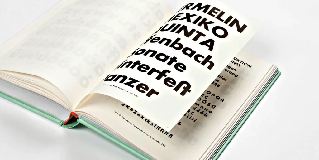
Typography in Focus: Futura, the First Font on the Moon
11th August 2020
Building a Website: Bespoke vs Using an Off-the-Shelf Theme
2nd July 2020
What Previous Recessions Taught us about Marketing
22nd June 2020
Data Visualisation: 6 Examples of Powerful Data Storytelling
27th May 2020
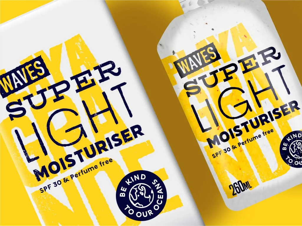
Creative Packaging Design: A Brief Response
7th May 2020
Vida’s Tyne Collective Project Featured by NatWest Business
1st May 2020
Shaping the pharmacy of tomorrow
18th March 2020
Reporting and reconciliation made simple for an award-winning FinTech platform
17th December 2019
Adapting Your Business’s Social Media Content: Our Top Tips