The Fintech industry is booming, and digital banking is only going to increase in popularity. With so many new players now in the market, creating a Fintech brand that stands out from the crowd is imperative.
Having worked with a host of new up-and-coming Fintech brands recently, we’ve taken the opportunity to put down a few thoughts on some of our thinking behind this work.
If you’re a Fintech owner wondering how to dream up a look and feel that reflects your product or service, these pointers should get you thinking.
1. Keep it simple
To many, finance can be an overly complex, often dull topic (forgive us!) which can often lack clarity to those outside the sector. It can seem to be a world full of reports, interest rates, percentages, confusing terminology, unnecessary spreadsheets and data which is sometimes difficult to understand.
Ultimately, this is why Fintech start-ups often begin. To solve those problems! And to simplify complex processes for customers.
This is why it pays (excuse the pun) to keep your brand simple but striking. It will attract people to you in the first place if your visual presence sparks interest but doesn’t complicate things in your potential customer’s mind.
Your language and tone should also humanise what you do. Choose your words wisely. It’s fine to use jargon if your target market understands it, but if your customers aren’t from your world, explain it in Layman’s terms.
2. Create user-friendly experiences
Customers want to access easy-to-understand financial services. Big players like Monzo, Revolut, Starling and Atom saw these basic problems as opportunities and addressed them with user-friendly digital products.
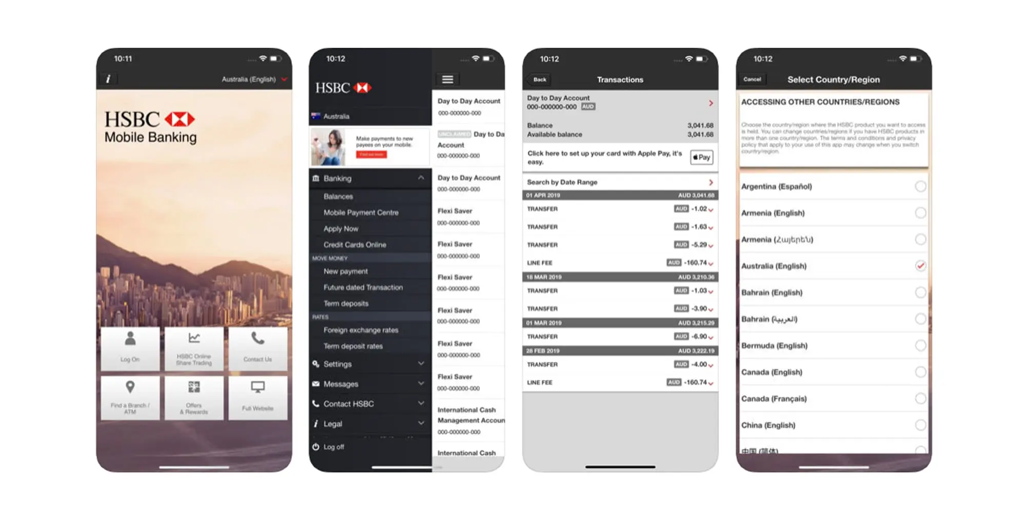
To illustrate this, we’ve looked at some different mobile interfaces – HSBC’s traditional banking app and that of Monzo.
HSBC’s interface looks complex, dull and hard to navigate.

Monzo’s design is much simpler in comparison, but it’s a lot more playful too. It uses a brighter, softer colour palette with pastel colours, rounded buttons, icons and plenty of white space, which in itself creates a better user experience.
It’s a design that is more aesthetically pleasing, smarter, clearer and better suited to mobile use. In our humble opinion, anyway.

3. Think outside the box with your Fintech brand’s identity
Traditionally, banks have quite a standard structure with regards to brand identity. A simple restricted colour palette, often reds and blues are used to portray a level of trust and authority. Quite often the names of these banks are literal, for instance, RBS (Royal Bank of Scotland) and Nationwide.
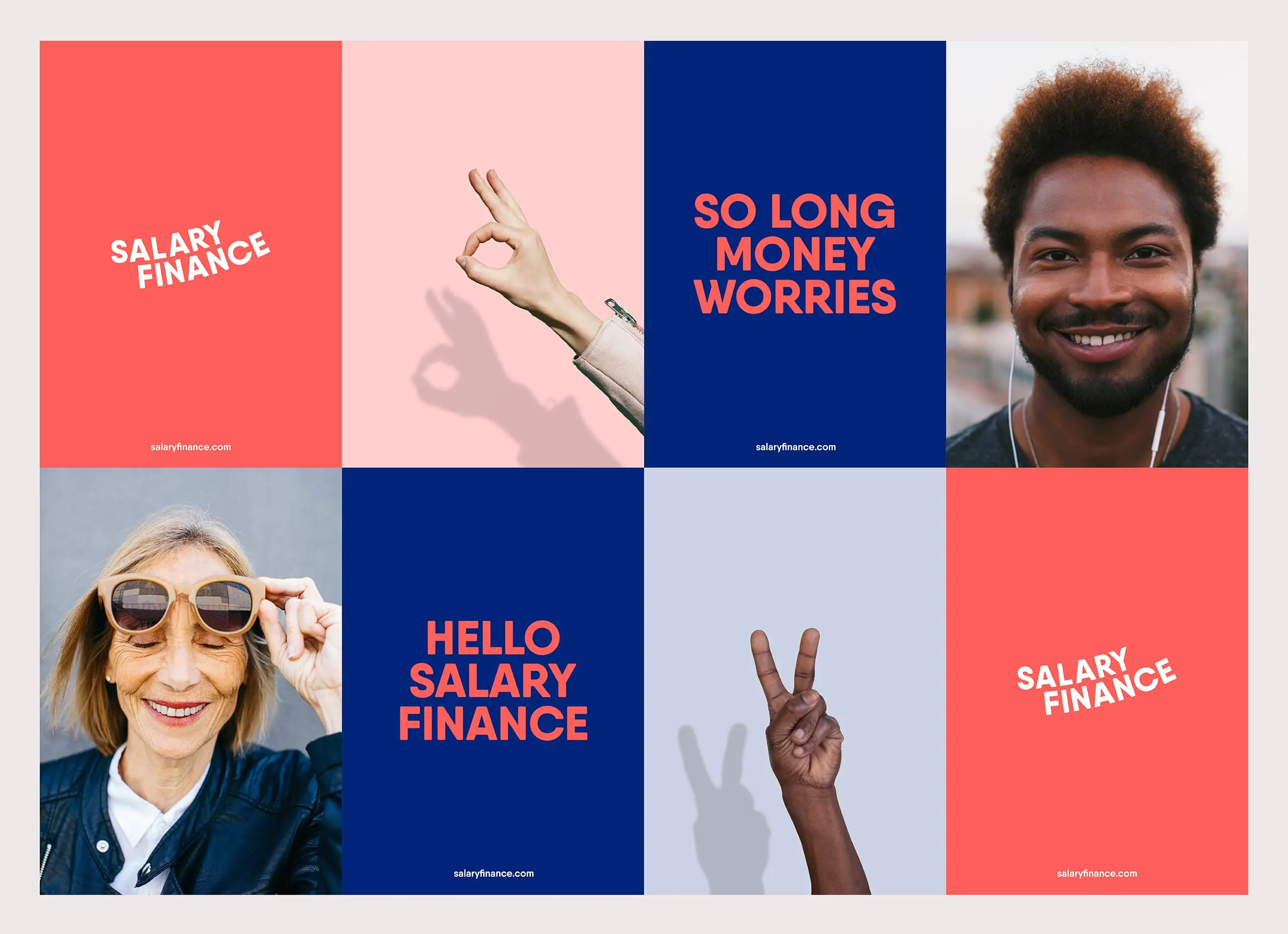
Start-up Fintech banks think outside the box when it comes to naming and branding. More often than not, they use bright colour schemes, and reflect a more inclusive, friendly tone.
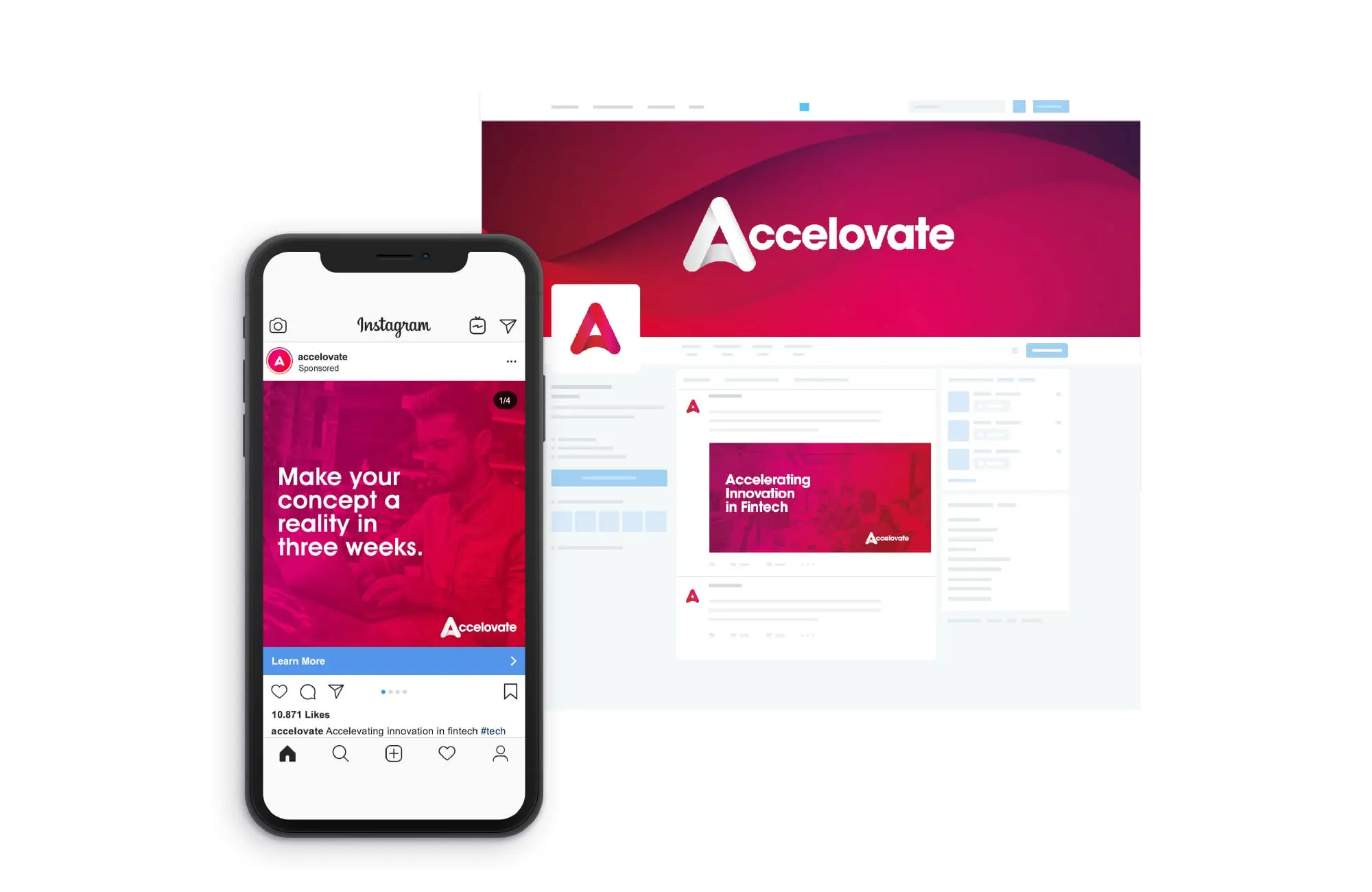
This is something that we had in mind when we designed the Accelovate brand last year. We pushed creative boundaries by using a gradient and a soft typeface to mirror the tone and values of the forward-thinking brand.

4. Build trust
By their very nature, most Fintechs operate as online-only businesses. There aren’t physical branches for customers to walk into, so how do you build trust?
Brand loyalty is built on trust, and it goes without saying that this is especially important when it comes to handling money. Think about the values your brand is built upon, how your solution promotes inclusivity, and how you’re going to talk about this in the content you create.
Social proof is everything here, especially for new brands. Customer testimonials, blogs that answer the questions that people are asking, and content that explains how you solve customer problems, are all tools you can use to build that trust.
Ensure that social proof is visible across your website, social media channels, and the stories you choose to tell in the press.

5. Create a personal tone
>So you’ve got lots of content ideas, but how are you actually going to pull them all together in a consistent way? Tone of voice.
>This is something that isn’t always considered in branding – but it’s just as important as what your brand looks like.
>When we say ‘create a personal tone’, we mean, create a tone that fits your brand, that brings your brand personality to life. That might mean going a bit more formal with the language, or it might mean using language that makes your customers feel like they’re talking to a friend. Whatever you decide, it should complete the overall brand identity by complimenting how your brand looks.
>One of our clients, Kani Payments, uses a conversational tone of voice in their brand communications. So when we were tasked with designing and building a new website that complimented and reflected their existing brand identity, we used a conversational tone across their website content – as they really are a canny bunch!
>Using conversational language reflects the ethos of Kani, and conveys the complicated things their software does in way that’s easy to understand.
Find out more about our work with Kani Payments?
Launching a new Fintech solution?
We design websites and create brands for tech companies that are doing incredible things all over the world.
You can take a look at some of our work here, or get in touch with one of the team for a chat about what you’re looking to achieve.

